September 1, 2011

Building extensions in QlikView: some hints & tips

Here are some useful hints & tips that I learned while working over Explainum Feeds -- our extension for creating context-dependent comments in QlikView applications.

First of all, I would like to thank Stephen Redmond for his very useful Beginners Guide to QlikView Extension Objects (part 1, part 2, part 3, part 4) -- a mustread for everyone who starts developing extensions.

If you have done with that guide then these hints might be useful for you as well:
  • Namings
  • Debugging the extension
  • Getting custom properties
  • Accessing other objects
  • Using external CSS stylesheets

August 29, 2011

Extension for creating comments in QlikView is publicly available

Explainum Feeds for QlikView -- an extension for creating context-dependent annotations in QlikView is publicly available now. You can get the extension, deployment guidelines and a couple of demo apps on http://feeds.explainum.com


Key features

  • Twitter-like feeds of comments linked to data context defined by selection in QV apps — e.g. select "London","2011" to see comments that relate to London and year 2011
  • Clicking a comment selects its context (like a bookmark)
  • Common feeds for different QlikView applications and servers
  • Doesn't require QlikView Server (however, internet connection is needed)
  • User names in comments (anonymous mode is also possible)
  • Works on both desktop (in WebView mode) and server installations
  • Many feeds per sheet and application
  • Zero-administration extension script updates
  • Free public service
Currently, the extension works only with QV 10 SR2, as SR3 has crucial bug that crashes extension (hope it will be fixed in SR4).

Technical issues can be discussed in dedicated thread on QlikCommunity.

August 17, 2011

Hot keys in QlikView: round up

Following the discussion on LinkedIn started by my previous post about hot keys in QlikView here is brief cheat sheet of hot keys shared by wonderful LinkedIn QlikView community:

Script Editor

<F5> or <Ctrl> + R
runs load script
<CTRL> + <Shift> + R
partial reload
<Ctrl> + T
shows model diagram
<Ctrl> + E
opens table editor for LOAD INLINE statements (cursor should be placed inside statement)
<Ctrl> + Q + Q
inserts script that generates several dummy tables
<Ctrl> + K + C
<Ctrl> + K + U
comments/uncomments blocks of script
<Ctrl> + F
allows search within the script in the debugger window

Design

<Control> + <Shift>
allows moving objects inside a chart
<Ctrl> + <Shift> + S
toggles visibility settings for all objects on a sheet
<Ctrl> + M
launches macro editor
<Ctrl> + E
launches script editor
<Ctrl> + T
shows model diagram
<Ctrl> + <Shift> + M
toggles macro security
<Ctrl> + <Arrow>
moves selected object pixel by pixel
<Ctrl> + <Shift> + <Arrow>
moves selected object for longer distance
<Ctrl> + <Alt> + V
opens variable overview
<Ctrl> + <Alt> + E
opens expressions overview
<Ctrl> + <Alt> + D
opens document properties
<Ctrl> + <Alt> + S
opens sheet properties
<Ctrl > + Q
opens current selection
<Ctrl> + <Shift> + Q
opens detailed technical information about application
<F5>
refreshes UI in WebView mode
<Alt> + <Enter>
opens property window of any object (including sheet)
<Ctrl> + <Tab>
cycles between open windows in QlikView or between tabs in object property window

Adding annotations in QlikView: beta-testers wanted!

I've made an extension for QlikView that allows creating annotations tied to selections. The extension works in connection with free public service Explainum Feeds developed by Max Ivak and me which allows to have single stream of comments even for different QlikView servers and applications.

It hasn't been released yet, but if you want to take part in closed beta-testing let me know at dmitry(аt)explainum.com

Here is a screenshot to give you an idea how it looks like (click to enlarge).


August 1, 2011

How to build good dashboard. Part 4: Layout

For those who haven't read previous parts -- here they are:

Part 1: Dashboards vs Reports

Part 2: Usage scenario

Part 3: Zoning

In previous part we talked about zoning -- how to organize dashboard elements by logical zones according to their function, meaning and priority. Now we have a question -- where to put these zones on a dashboard? To answer this question we have to take into consideration findings from eye tracking usability studies. Eye tracking by itself is a big and very interesting theme which is worth spending some time studying it (you can start from googling). Briefly, eye-tracking testing helps to understand at what parts of a page users look first, where they go next, what they put more attention to, etc. To understand this technique more deeply you can take a look at one of Google's articles about eye-tracking. Strictly speaking, it is not correct to apply findings from studying web-pages (which mostly contain text, photos and often advertisement) to BI dashboards (which contain charts and tables and never advertisement). Sure, results of an eye tracking study made specifically for BI dashboards would be much more appropriate here, unfortunately I never came across anything like them (if you did -- I would be grateful for link). However, due to common reading habits and strong internet literacy among BI users, I believe we can apply similar logic for our goals as well.

Below is depicted typical user eye path:


Users start looking on a page from top-left corner (1), then study upper part (2) and slide to the left part of a page (3-4). Then they look through right part (5-6) and finally -- bottom part or footer (7). So, place your zones on a dashboard according to their importance and priority and user eye path. Put most important zones, like alerts or top-priority KPIs, into areas marked with (1-2), more detailed information into areas (3-4-5-6) and supplementary info at bottom (7).

In the next part I will speak about managing attention.

July 21, 2011

Hot keys in Qlikview Chart Properties form

If you work a lot with QlikView then you probably miss a lot of small usability features there. One that I miss strongly -- is a hot key to exit Edit Expression dialog with changes applied. At least it could be possible if they did confirmation popup (invoked by pressing ESC) not as "Close the dialog and lose the changes?" (so you either lost changes or stay in dialog) but "Save changes and exit? Yes/No". Arghhhh.......

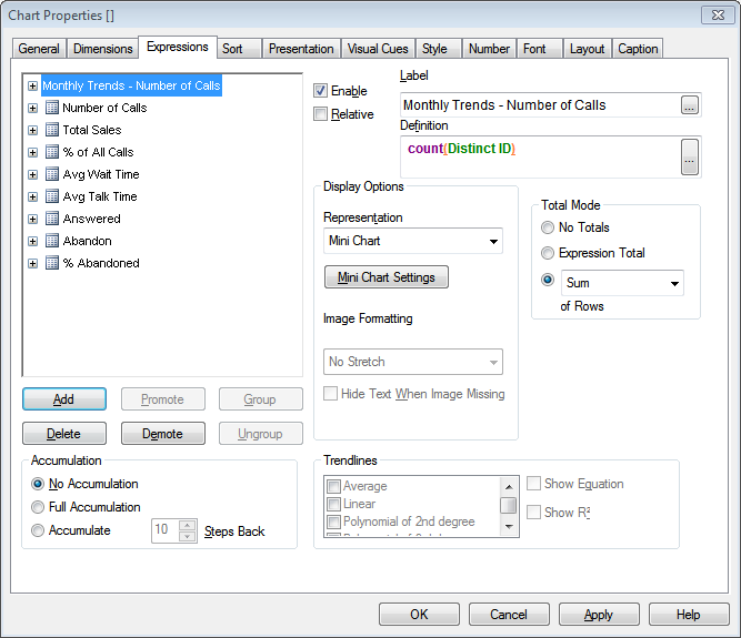
Yet, some hot keys do exist. For instance in Chart Properties Expressions tab you can use these hotkeys instead of dragging your mouse back and forth every time:

  • E - demote expression in list (move down)
  • P - promote expression in list (move up)
  • Enter - open Edit Expression dialog
  • F - go to edit expression definition (that small textarea in the tab)
  • D - delete expression
  • A+A -- add new expression (don't ask me why it has to be pressed twice -- this is Qlikview)
  • B - enable/disable expression
  • M - open mini chart settings (for mini charts only)
  • T - toggle representation (with awkward behaviour)
  • R - toggle relative (musthave hotkey, duh!)
It would be reasonable to at least add capability to move selection of expression by up/down arrows. Can we hope to have this in any future release?

If you know any other useful hot keys -- feel free to say it in comments here.

Note 1: All this relates to Qlikview 9. Qlikview 10 might have some of these issues resolved.
Note 2: These hotkeys might be not intended by design but exist as side effect.

PS. By the way, do you know that moving your hand from keyboard to mouse takes 0.7sec and moving it back takes 0.9sec. You can spend up to half an hour every day just for useless movements just because of absence of convenient hot keys.

Take a look also on cheat sheet with most useful QlikView hotkeys .

May 20, 2011

How to build good dashboard. Part 3: Zoning.

In Part 2 I mentioned that prioritization is the key thing in building dashboards. Prioritization of content has to be supported first of all by right layout and zoning of a dashboard. Let's talk about this a little bit.

Zoning
Think about your dashboard like if it was a house. Unless you're a very original person, in your house you typically don't want to keep car accessories in the bedroom, dinner table in the bathroom and washing machine in your dining room. Instead, you keep car stuff in the garage, have meals in dining room and do your laundry in the basement or laundry room, because your house has logical and functional zones. The same should be applied for dashboards as well -- define logical and functional zones on your dashboard. Usually there are not more than 5-6 of them on a single sheet. Here is an example:


As you can see on example above there are 6 zones. Notice, however, that some zones can also be logically grouped -- e.g. Suppliers and Inventory, Sales and Cash flow, Context selection and Alerts. Sometimes these logical groups can overlap -- when a certain zone can belong to two logical groups. Here is an example:


In this case cash flow has two major components -- incoming money (from sales) and expenses (money that mostly go to suppliers). Therefore, Cash flow zone can be shown as overlapping segment from both Sales and Suppliers zones.

So, what should be size and position of the zones? Regarding size -- let's use our analogue with house once again. Typically you don't want your laundry room be the biggest room in the house. Why? Because your house is for living, not for laundry (unless you operate a laundry business and live there). The same is true for dashboards. As screen size is limited, you should allocate the largest zones for the most important information and keep less important data in smaller zones (however it doesn't mean that you should have an important pie chart that occupies 60% of your screen room).

In Part 4 I will talk about positioning zones and elements -- which is layout.