January 15, 2019
Hardware is now effectively free
Back in the early days of computers the hardware was expensive and the software was frequently free. Software was viewed as just a component of the hardware it was shipped with. When a company purchased a computer it's the hardware that was considered the acquired asset.
Eventually software became priced separately. So when a company purchased a computer system it viewed hardware and software as separate items and as different kinds of assets (tangible/intangible).
Nowadays, the tectonic migration of software to the cloud brings us to the other end of the scale -- software is expensive and hardware has effectively become free.
Software has eaten the hardware.
December 13, 2018
Cloud data warehouses on the rise because corporate users increasingly underserved by internal IT departments
When I was at the Tableau Conference 2018 in New Orleans (which we sponsored, btw) I had a chance to talk to other Tableau technology partners and finally started understanding the driving cause behind the proliferation of cloud-based data warehouses offered by various vendors (such as Panoply, Snowflake, or 1010data). Previously, I assumed that the main value proposition of cloud warehouses is cost reduction and the main target audience for such solutions are IT departments. However, it turns out that the main target audience is actually business (i.e. non-IT) departments and the main selling point is manageability and independence from the internal IT. Why? Because the internal IT is becoming increasingly inefficient in enabling business departments to achieve their goals. Business users are not happy with the pace of delivery, responsiveness, and the price tag provided by the internal IT. Up to the point when they start looking around.
This wasn't news to me, as I run a company that helps business users to get a degree of independence from IT. Rather it looked like yet another confirmation of a tectonic shift slowly happening in organizations.
In the vast majority of non-technology organizations internal IT departments have a supporting role and are typically viewed as cost centers, rather than revenue generators. Therefore, cost minimization becomes the driving force behind centralization of IT administration, development and procurement. On one hand, centralization allows achieve the economies of scale. On the other hand, centralization effectively creates internal monopolies. The larger is the organization, the more perceivable are the downsides of such monopoly. Imagine, that in a remote town with 50K population (size of a large corporation) there is only one computer shop (let's assume it's still the 90s and there is no Amazon) and no way to purchase anything computer-related from another town/city. What would happen to the level of service provided by that shop? With no competition, the prices will go up, and service quality will go down because a monopoly has no incentive to do it otherwise. The same happens with corporate IT departments -- they concentrate too much bureaucracy with no efficient feedback loop in place that would ensure constant improvement.
I believe, this trend has nothing to do with personal and professional qualities of people working in internal IT departments. Many of them have both skills and goodwill to do best for their internal customers. I suspect it's some kind of institutional problem that has its roots in traditional management thinking.
Although, there is some experimentation going on. I've seen an interesting attempt of a large bank to build its IT division in a form of a service supermarket for business users where business departments have the final word on what kind of business applications they need and when, and IT only takes care of security, maintenance and administration. Probably, the internal IT should ideally be the preferred vendor, but not the only option available to internal customers.
Analytical systems in general and data warehouses in particular are subject to the conflict of interests between the business and the IT side probably more than any other kind of enterprise system. They are predominantly demanded by business users, however they are very complex from a technical perspective. To make things worse, data warehouses are frequently viewed as important but not strategically important to the organization. Which lets the implementation deadlines slip by months and sometimes years.
The idea of cloud data warehouses that target business users makes sense to me and signals about a bigger trend going on in the industry that aims to overcome inefficiencies created by over-centralization of IT.
September 14, 2018
How I came up with the idea of EasyMorph
One of the most frequent questions I'm asked is "How did you come up with the idea of EasyMorph?".
Throughout my career of Business Intelligence consultant I could observe how non-technical people work with [structured] data. Even 15 years ago, their setup was pretty much the same as it can be commonly found these days: an IT team generates various extracts from transactional and accounting systems, which then are loaded and processed in Excel by business users without a technical background.
All in all, it worked rather efficiently. The IT part of this setup was apparently automated as much as possible, while the business part remained entirely manual with the exception of a few occasional VBA macros here and there. While this approach had some drawbacks, it was assumed a reasonable compromise between those who are proficient in data manipulation but don't have an actual need for it, and those who need it but have limited technical skills.
However, eventually I started noticing that the complexity of calculations is growing. Loading a text extract and calculating a few simple metrics from it in Excel is one thing. But loading several files, fixing data quality issues, applying various business rules and calculating complex metrics is another thing. Complexity (as well as probability of human errors) increases particularly sharply when there is a need for merging (joining) two or more tables, because Excel doesn't do joins natively. Joins need to be emulated which is a not so trivial task in Excel, especially when you deal with datasets of varying length and potential problems with uniqueness of primary keys.
I guess, this growth of complexity can be explained by two simultaneous trends:
1) Slow explosion of data sources as more and more processes became automated. As software keeps "eating the world", more data collected, more metrics tracked, and more things monitored.
2) Centralized IT-led initiatives such as data warehouses couldn't keep up with this explosion. The task of consolidation of data coming from various sources has been shifting to a great extent from IT to business users, effectively becoming decentralized instead of centralized.
For me, the turning point was a project in a large North American bank (which later would become our 1st customer). In that project, I had to deal with an Excel report that was produced on a daily basis with 3 text extracts merged, various business rules applied and multiple metrics calculated. Due to the complexity of calculations, the VBA macro that did all the processing was very obscure and had more than 1000 lines. The financial analyst who created it had moved to another country and was no longer accessible. There was no documentation on it. It took me a few weeks to reverse-engineer the business logic behind the script. A few errors were found that caused some metrics to calculate incorrectly.
There is no point in blaming the author of the report for the errors, obscurity, and the lack of documentation. After all, finance analysts are not supposed to do high quality coding/scripting. Financial analysts are supposed to do financial analysis, not software development.
For me, it became clear that there should be a better way of doing things. And then EasyMorph was born.
Labels:
EasyMorph
July 12, 2018
Data Preparation is the new Business Intelligence
- Emerging technology
- Designed for the convenience of business users (which is very atypical for enterprise software, btw)
- Introduces a degree of independence from IT departments (which also means a lower burden for the latter)
- Low general awareness of this type of tool in the market
- General underestimation of the proposed value ("why can't we just use Excel for this")
- A rare "System-to-human" kind of enterprise application. Not "Human-to-system" (front-end) or "system-to-system" (back-end) software commonly found in the enterprise.
- Designed and suited for mass user adoption, rather than for use by 1-2 people in a department or even entire company.
- From a licensing perspective the total cost of ownership is within $40-100 per month per user.
Having this analogy, it may be possible to predict certain future trends for the Data Preparation industry:
- User adoption will broaden slower than anticipated by Data Prep vendors. It will probably take 10-15 years to reach the "late adopter" stage and market saturation.
- User adoption will be wider than first customers (early adopters) envision it.
- There will be attempts for "Data Prep standardization" across organization but they will fail, just as BI standardization failed.
- Enterprise administration/governance features will become necessary sooner rather than later.
- Authoring will shift from desktop clients to web-browsers.
- Expensive software (>$100/mo/user) will be squeezed out from the market by competition.
- There will be a wave of consolidation when major Data Prep companies are acquired by big enterprise vendors.
For me, a confirmation of this similarity is that most of multi-user installations of EasyMorph tend to grow over time doubling in about 2 years, on average. We've recently seen a customer that requested 30 user licenses just for one business line. This tells me that although data prep tools are close to ETL systems from a technical standpoint, from a user adoption perspective they clearly resemble Business Intelligence and Data Discovery applications.
Labels:
Unplugged
May 6, 2018
Why enterprise software is switching to subscription-based pricing
While software vendors are apparently pushing the trend, the customers sometimes have mixed feelings about it. On one hand, the significant reduction of upfront licensing costs makes rolling out new software deployments faster and with less risk -- you can start with purchasing only a few licenses and see how it goes. In the worst case, you just cancel the subscription instead of turning expensive licenses into shelfware.
On the other hand, in the long run subscription based pricing appears to be more expensive. In the previous pricing model, Tableau Desktop Professional cost $1999 paid once. I don't remember what was the maintenance fee, but for the industry the typical rate is 20-25% per year. If we assume 25% maintenance, in 5 years the total cost of ownership would be $3998 per user, while under the new subscription model the cost will be $4200. In a 10 year term the difference becomes even more significant - $6500 vs $8400 per user, at least on paper.
Is switching to subscription-based pricing just a marketing gimmick to squeeze more money out of customers? I don't think so, and here is why:
First of all, in a highly competitive market vendors can't squeeze more money from customers simply because a) competition won't miss a chance to undercut pricing, and b) the amount of money (market size) remains the same, no matter what pricing model is applied.
If so, why the change? As someone who runs a company that also employs a subscription based model, I believe the answer is sustainability.
The problem with the one-time pricing model is that it came from the times of industrialization, when the economy was based on physical, tangible goods. It's not the only business pattern that has been inherited from that epoch. The 8-hour workday from 9 to 5, and the need to commute to the workplace every workday have also originated from those times, because you know it was kind of problematic to do industrial-scale cast iron melting working remotely from home. Everybody needed to be at the factory and work hard with their hands.
Producing physical, tangible goods required lots of materials and some labor too. In the cost structure, the part of materials was typically much bigger than the cost of labor. Therefore, one-time pricing in such economy was logical because the cost was mostly driven by materials.
In the modern, post-industrialization economy some of the old models don't work well anymore. For many knowledge-based professions, such as software development, working fixed hours 9 to 5 or commuting to the office every day is becoming increasingly irrelevant, if not counter-productive.
A similar thing is happening with pricing models too. Labor by its nature is subscription-based, because an employee isn't get paid a lump sum of money upfront and then is expected to work forever without additional pay. Instead, s/he is paid a salary which is basically a monthly or weekly subscription to the worker's services.
In software development cost, labor comprises the biggest share. Therefore the expense structure for a company is predominantly of subscription nature. At the same time, having revenue structure that is based on one-time payments introduces financial instability and risk that needed to be offset by higher pricing and/or more conservative product development strategy.
With that in mind, switching to subscription model totally makes sense for software vendors as it allows to offset subscription-based expenses with subscription-based revenue and achieve better financial sustainability for the company. It also works well for the customers, as the vendors can now be less conservative in R&D spending which means that users will receive better products sooner.
UPDATE 2/2/2019
Switching to subscription-based pricing has an interesting ethical aspect as well. One-time pricing creates for enterprise sales people a [wrong] incentive that is not aligned with the interests of customers. Under the traditional pricing model the sellers quickly lose interest in customer success after the sale is closed. For them, the sale IS the success, while for the customer the success is what is supposed to only happen AFTER the sale. A subscription-based pricing model aligns the interests of sellers and customers as the sellers now have more "skin in the game" which is attractive to customers.
UPDATE 2/2/2019
Switching to subscription-based pricing has an interesting ethical aspect as well. One-time pricing creates for enterprise sales people a [wrong] incentive that is not aligned with the interests of customers. Under the traditional pricing model the sellers quickly lose interest in customer success after the sale is closed. For them, the sale IS the success, while for the customer the success is what is supposed to only happen AFTER the sale. A subscription-based pricing model aligns the interests of sellers and customers as the sellers now have more "skin in the game" which is attractive to customers.
Labels:
Unplugged
January 27, 2018
Automation server for Qlik Sense
Qlik Sense is in many ways a more advanced platform than its predecessor, QlikView. Scalability, rich APIs, enterprise-level administration -- there are many features of a good architecture in it. However, what can be challenging for Qlik Sense customers (besides dealing with rudimentary data visualization) is automation. QlikView had embedded VBA scripting engine, which let designing automation scenarios initiated by users, but Qlik Sense doesn't have it. Disabled in the standard mode EXECUTE statement only aggravates the situation.
In this article, I'm proposing to extend Qlik Sense's capabilities with an automation server, based on EasyMorph Server. Such extension significantly simplifies a whole range of automation scenarios initiated by Qlik Sense user, that are difficult or non-trivial to implement otherwise. For instance:
- Database writeback based on current selection in Qlik Sense.
- One-click export of a subset of data from a Qlik Sense app into an external system or a disk folder.
- Sending personalized emails with attached customized data extracts from Qlik Sense.
- Downloading a particular file from a web-site and dynamically adding its content to a Qlik Sense app.
- Automated data quality checks of incoming source data with rule-based email notifications.
The integration mechanism between Qlik Sense and EasyMorph Server is based on REST API and Websockets (see the diagram below):
![]() |
| Click to zoom |
Actions are initiated by a Qlik Sense user by clicking a dynamically generated hyperlink, or an extension button. This triggers an EasyMorph Server task which runs an EasyMorph project with specified parameters (passed through the hyperlink or extension). The project performs required actions with external files and systems. Finally, the task status is reported back into the Qlik Sense app that initiated it. Alternatively, the task initiates a full or partial reload of the app using the REST API.
A few benefits of such integration scheme:
- In one Qlik Sense application there can be multiple action buttons that initiate different actions.
- It works well with tiered Qlik Sense apps, where one app is for ETL, another for building a data model, and another one for the UI objects.
- Closed loop feedback: task status and result are reported back to the user. If the task fails the errors will be reported to the user as well.
- Task parameters can be assigned dynamically using Qlik Sense variables and expressions.
- The action server can be hosted on a different machine thus reducing exposure of the Qlik Sense sever.
At this point we're half-way to implementing the integration scheme described above. This means that some of its elements are already in place, while other are in active development and will be released soon. As of version 3.7.1 already available:
- EasyMorph Server REST API
- Triggering EM Server tasks via hyperlinks that can contain task parameters
- Executing external applications and Windows shell commands.
- File commands: copying, downloading, unzipping, etc.
- Conditional IF...THEN...ELSE workflows
- PowerShell integration (think VBA replacement)
- Sending emails with attachments
- 90+ ETL transformations and 100+ functions.
The tool set described above is already suitable for adding automation capabilities to Qlik Sense apps. For instance database writebacks, extract generation or email sendouts are already possible by using dynamic hyperlinks in Qlik Sense applications. For better user experience and more advanced automation capabilities, a few more features are being developed and planned for release in version 3.8:
- An interactive Qlik Sense app extension for triggering EM Server tasks and monitoring task status and errors in real-time.
- The Qlik Sense Command transformation for triggering reloading Qlik Sense apps and QMC tasks right from EasyMorph projects.
- Fetching emails and processing attachments.
With the addition of these features, the full integration scenario described in this article becomes possible. Besides that, EasyMorph will be able to work as a visual data transformation tool for Qlik Sense:
![]() |
| Click to zoom |
In this case, a user triggers (through a link or extension) an EasyMorph task that generates QVD files (one file per one table in data model) and initiates reloading of the Qlik Sense app that called it. The app loads the generated QVDs.
If you would like to talk about about automation for Qlik Sense, send me an email (you can find my address in the upper right area of this blog or here).
To receive future updates on EasyMorph and its integrations with Qlik and other systems, subscribe to our newsletter on the download page.
Labels:
EasyMorph,
Qlik Sense,
QlikView
January 4, 2018
EasyQlik QViewer acquired by Rob Wunderlich
Effective January 1st, 2018 EasyQlik QViewer has been acquired by Rob Wunderlich.
I believe it's a great outcome for the product, its users and customers. It was a bit challenging for me to keep focus on QViewer and EasyMorph simultaneously, which resulted in a slower development pace for QViewer. It's hard to imagine a better new owner than Rob who is well known in the Qlik community and who surely has a great vision on what would make QViewer even more useful.
From now on, the existing licensed QViewer customers should contact support@panalyticsinc.com for all questions related to QViewer. The website http://easyqlik.com keeps operating as usually.
I, from now on, focus solely on EasyMorph.
Read also Rob's statement on the acquisition.
Labels:
QViewer
October 19, 2017
Tableau Maestro vs 3rd Party Data Prep Tools
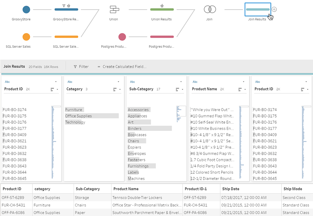
If you haven't seen Tableau Maestro -- you should. I've seen the demo shown at the Tableau Conference 2017 and it's pretty cool (sorry, can't find a publicly available video). It's obvious that someone from the product management team has done a good job trying to address common challenges of data preparation (such as incorrect joins) in a visual way. Of course, Maestro is still in its infancy, but its introduction raises interesting questions. First of all, what does it mean for 3rd party data preparations tools, that target Tableau users?
Before I go further let me classify the existing data transformation offerings:
Personal Data Preparation Tools
These are rather simple applications that allow performing basic operations such as cleansing, filtering, merging in a linear and non-parameterized way. While they're visual and target non-technical audience their applicability is usually pretty limited as they don't support non-linear workflows (a must have for anything non-trivial), have no means of automation and integration (e.g. running external applications) and have a limited set of available transforms. On the positive side, they're usually reasonably priced and easy to start with.
Departmental Data Transformation (ETL) Applications
Applications in this category are full-featured, rather capable ETL programs that allow designing non-linear workflows (that typically look like a block diagram where inputs and outputs of blocks are connected with arrows), integrate with external applications, and run parameterized tasks on schedule. They are way more capable than the personal data prep tool described above, while still remaining rather affordable. However the vast majority of them have one big flaw that renders them barely useful for Tableau audience -- they are too IT/DBA/SQL-centric and therefore simply not suitable for an average Tableau user. Unless s/he wants to dive into topics such as the nuances of differences between CHAR, VARCHAR and NVARCHAR data types on a daily basis (hint: it's not much fun).
EasyMorph, the data transformation tool I've designed and produced, technically also belongs to the Departmental ETL category. However unlike most ETL tools, it's designed from the ground up for non-technical users first of all, which required walking away from the traditional approach to ETL and re-thinking data transformation from scratch.
Enterprise ETL platforms
These are mastodons. In terms of features, scale, and of course, price. Big guns with a big price tag. Most of them are also heavily IT-centric, however some Enterprise ETL platforms (e.g. Alteryx and Lavastorm) have managed to become closer to non-technical users than the rest of the group. The exorbitant cost of licenses in this category severely restricts number of people that can use it for self-service data transformation within an organization. Especially, taking into account that in many cases they are used for departmental (and even personal) ETL, not enterprise, which is clearly overkill. After all, having 75-80% of revenue reinvested into sales and marketing allows hiring very skilled sales people :)
Now, where does Maestro fit in this classification? While it's still in beta, and no final product has been demonstrated yet I probably wouldn't be terribly off base if I assume that Maestro is a personal data preparation tool (probably with a non-linear workflow). Which means that Maestro, once released, would leave very little room for 3rd party software vendors in this category, especially if offered for free. Many will have simply to leave the market.
OK, what about EasyMorph then? I believe Maestro is a good thing for EasyMorph. While some our potential users might not realize at first that the two tools are in different categories, the introduction of Maestro actually makes EasyMorph a big favor:
1. It proves that good data analysis requires good data preparation. Tableau developers are incredibly creative people. It never ceases to amaze me what kinds of hacks and workarounds they use in Tableau in order to bring the source data into necessary shape. However, in many cases a decent non-linear data transformation tool would make this task straight forward, maintainable and debuggable.
2. It introduces the idea of a dedicated data transformation tool for wide audience. When pitching EasyMorph to various organizations I noticed that the idea of a specialized data transformation tool is not familiar to the non-technical audience. Developers understand the idea of a dedicated ETL tool and the benefits such a tool can provide. But business users (who comprise the biggest part of the Tableau user base) usually have hard times understanding the whole idea of visual data transformation. Maestro solves this task for us. With the power of Tableau's marketing :)
Someone said, that it's Apple and Steve Jobs who have taught smartphone users to buy apps and music instead of pirating it from somewhere. Apple's AppStore and iTunes have changed the mindset. I believe that Maestro will discover to many Tableau fans the convenience and power of visual self-service data preparation.
3. It makes it easier for us to explain to Tableau audience what EasyMorph is. Now it's plain simple: "EasyMorph is Maestro on steroids". The more people will use Maestro, the more people will buy into the benefits and convenience of visual programming (yes, Ladies and Gentlemen, it's visual programming), so that EasyMorph would be a logical next step for Maestro users once the complexity of required calculations grows beyond trivial.
PS. It's interesting to see that the "data kitchen" concept that I wrote about almost 2 years ago has been materializing more and more.
![]() |
| Tableau Maestro. This screenshot belongs to tableau.com |
Before I go further let me classify the existing data transformation offerings:
Personal Data Preparation Tools
These are rather simple applications that allow performing basic operations such as cleansing, filtering, merging in a linear and non-parameterized way. While they're visual and target non-technical audience their applicability is usually pretty limited as they don't support non-linear workflows (a must have for anything non-trivial), have no means of automation and integration (e.g. running external applications) and have a limited set of available transforms. On the positive side, they're usually reasonably priced and easy to start with.
Departmental Data Transformation (ETL) Applications
Applications in this category are full-featured, rather capable ETL programs that allow designing non-linear workflows (that typically look like a block diagram where inputs and outputs of blocks are connected with arrows), integrate with external applications, and run parameterized tasks on schedule. They are way more capable than the personal data prep tool described above, while still remaining rather affordable. However the vast majority of them have one big flaw that renders them barely useful for Tableau audience -- they are too IT/DBA/SQL-centric and therefore simply not suitable for an average Tableau user. Unless s/he wants to dive into topics such as the nuances of differences between CHAR, VARCHAR and NVARCHAR data types on a daily basis (hint: it's not much fun).
EasyMorph, the data transformation tool I've designed and produced, technically also belongs to the Departmental ETL category. However unlike most ETL tools, it's designed from the ground up for non-technical users first of all, which required walking away from the traditional approach to ETL and re-thinking data transformation from scratch.
Enterprise ETL platforms
These are mastodons. In terms of features, scale, and of course, price. Big guns with a big price tag. Most of them are also heavily IT-centric, however some Enterprise ETL platforms (e.g. Alteryx and Lavastorm) have managed to become closer to non-technical users than the rest of the group. The exorbitant cost of licenses in this category severely restricts number of people that can use it for self-service data transformation within an organization. Especially, taking into account that in many cases they are used for departmental (and even personal) ETL, not enterprise, which is clearly overkill. After all, having 75-80% of revenue reinvested into sales and marketing allows hiring very skilled sales people :)
Now, where does Maestro fit in this classification? While it's still in beta, and no final product has been demonstrated yet I probably wouldn't be terribly off base if I assume that Maestro is a personal data preparation tool (probably with a non-linear workflow). Which means that Maestro, once released, would leave very little room for 3rd party software vendors in this category, especially if offered for free. Many will have simply to leave the market.
OK, what about EasyMorph then? I believe Maestro is a good thing for EasyMorph. While some our potential users might not realize at first that the two tools are in different categories, the introduction of Maestro actually makes EasyMorph a big favor:
1. It proves that good data analysis requires good data preparation. Tableau developers are incredibly creative people. It never ceases to amaze me what kinds of hacks and workarounds they use in Tableau in order to bring the source data into necessary shape. However, in many cases a decent non-linear data transformation tool would make this task straight forward, maintainable and debuggable.
2. It introduces the idea of a dedicated data transformation tool for wide audience. When pitching EasyMorph to various organizations I noticed that the idea of a specialized data transformation tool is not familiar to the non-technical audience. Developers understand the idea of a dedicated ETL tool and the benefits such a tool can provide. But business users (who comprise the biggest part of the Tableau user base) usually have hard times understanding the whole idea of visual data transformation. Maestro solves this task for us. With the power of Tableau's marketing :)
Someone said, that it's Apple and Steve Jobs who have taught smartphone users to buy apps and music instead of pirating it from somewhere. Apple's AppStore and iTunes have changed the mindset. I believe that Maestro will discover to many Tableau fans the convenience and power of visual self-service data preparation.
3. It makes it easier for us to explain to Tableau audience what EasyMorph is. Now it's plain simple: "EasyMorph is Maestro on steroids". The more people will use Maestro, the more people will buy into the benefits and convenience of visual programming (yes, Ladies and Gentlemen, it's visual programming), so that EasyMorph would be a logical next step for Maestro users once the complexity of required calculations grows beyond trivial.
PS. It's interesting to see that the "data kitchen" concept that I wrote about almost 2 years ago has been materializing more and more.
September 17, 2017
Excel is incredibly successful application development platform
The more I think about Excel the more it looks to me as an application development platform, probably the most successful ever.
My first programming language was BASIC. Therefore the user interface of my first programs was basically a sequence of questions, which required typing in answers. PRINT this, INPUT that, IF/THEN, GOTO here. I started reading books on computer languages, learned Pascal, C++, ASM and eventually went to study Computer Science. A rather standard story of a software developer.
For many people far from software development their first programs looked radically different. They didn't even know they were programs. Because they were spreadsheets.
Modern Computer Science identifies 3 programming concepts:
- Imperative (e.g. BASIC, C++, Python)
- Functional (e.g. List, ML, Haskell, OCaml, F#)
- Declarative (e.g. SQL, Prolog)
While there are heated debates among CS enthusiasts whether Excel falls into the declarative or functional programming concept, or it's a separate category on its own, most people never think of spreadsheets as of any kind of programming at all. But that didn't stop them from creating their first application without even knowing about it, because it was not a program in traditional sense, it's a spreadsheet. Millions of people develop applications and don't even realize it. Isn't it amazing?
If you think about it for a moment, a spreadsheet is a great way of creating applications. No need to deal with UI libraries, dialogs and forms -- just write in a cell what you need where you need it and you're done. You don't even have to bother with aligning objects -- everything is already aligned. A spreadsheet is visual and reactive -- whatever change you make, the result is immediately visible. It has only two abstractions: a cell, and a formula, and therefore is very easy to learn.
Yes, spreadsheet apps don't have the polished, productionalized look of "real" applications. But my first BASIC program didn't look that either. Yet it did its job. One can argue that spreadsheets are not suitable for general purpose programming. But neither is SQL, yet it's great for its purpose.
Spreadsheets allowed millions of people without programming skills create practical, useful applications that solve real life problems. If this is not amazing success for an application platform, then what is?
Labels:
Excel
May 30, 2017
Understanding bar charts in QViewer listboxes
Starting from version 3 listboxes in QViewer have green bars beneath counts, like in the image below:
It may look as the bars are proportional to counts with 100% equal to the max count in the column. However, it's not the case. If you look closely at the screenshot above you can notice that values 02 and 08 have full bars (i.e. 100%) but their counts are not equal (2,236 and 2,922 respectively). More than that -- when no filter applied, all bars are at 100% regardless of the counts. OK, what do they mean then?
Each bar shows the selection ratio for each value and its value is calculated as count for current selection / total count of that particular value.
The best way to understand the bars is to think of them as of an inclusion indicator. They show the degree to which the current selection includes particular value: 0 means current selection doesn't include the value at all, while 100% means that current selection includes all rows with the value. That's why when no filters applied all bars are at 100%. For instance if dataset has field "Gender" with two possible values: "Male" and "Female", the bars would show to what degree the current selection includes males and females present in the dataset.
It may look as the bars are proportional to counts with 100% equal to the max count in the column. However, it's not the case. If you look closely at the screenshot above you can notice that values 02 and 08 have full bars (i.e. 100%) but their counts are not equal (2,236 and 2,922 respectively). More than that -- when no filter applied, all bars are at 100% regardless of the counts. OK, what do they mean then?
Each bar shows the selection ratio for each value and its value is calculated as count for current selection / total count of that particular value.
The best way to understand the bars is to think of them as of an inclusion indicator. They show the degree to which the current selection includes particular value: 0 means current selection doesn't include the value at all, while 100% means that current selection includes all rows with the value. That's why when no filters applied all bars are at 100%. For instance if dataset has field "Gender" with two possible values: "Male" and "Female", the bars would show to what degree the current selection includes males and females present in the dataset.
Labels:
QViewer
April 17, 2017
QViewer ver.3.3 is out
QViewer version 3.3 is now available for downloading. Here is what's new and exciting in the new version:
Support for QVD files larger than 2GB
Now you can open QVD files basically of any size. It was tested on QVD files up to 20GBs. Technically, at this point the only limitation is 2 billion rows per file. QViewer aggressively parallelize calculations so you may want to give it some time to perform necessary counts after opening a large file, because during that time CPU utilization can be near 100% which would make the application less responsive.
New Partial Load workflow
In the new version the workflow for partial load was significantly changed. The Partial Load button has been removed. Instead, when a file larger than certain threshold is opened QViewer suggests performing a partial load (see the screenshot below). The threshold can be set at 512MB, 1GB, 2GB, 4GB or 8GB.
Indication of metrics affected by partial load
When a partial load is performed some metrics calculated by QViewer can be distorted because the loaded dataset is incomplete. To avoid confusion QViewer now shows which metrics are affected by partial load (shown red) and which are not.
Comments in generated script
When generating a LOAD statement, QViewer can now insert field comments obtained from the XML header. These comments are typically created using COMMENT FIELD or COMMENT TABLE statements in QlikView / Qlik Sense before exporting a table into QVD file.
Download QViewer
UPDATE 4/23/2017
I'm considering further improvements to QViewer. The ideas are floating around a few topics: table inspection for Qlik Sense Server, [shareable] selection bookmarks, support for other file formats (e.g. QVX, CSV, or XLSX), aggregation with built-in pivot tables (with selections applied). However, I'm not sure what would be the most useful for the Qlik dev community. I would appreciate hearing it from you -- what would you like to see in future versions of QViewer? Feel free to send me your suggestions (see my email in the upper right corner of this blog), or just leave a comment below.
Support for QVD files larger than 2GB
Now you can open QVD files basically of any size. It was tested on QVD files up to 20GBs. Technically, at this point the only limitation is 2 billion rows per file. QViewer aggressively parallelize calculations so you may want to give it some time to perform necessary counts after opening a large file, because during that time CPU utilization can be near 100% which would make the application less responsive.
New Partial Load workflow
In the new version the workflow for partial load was significantly changed. The Partial Load button has been removed. Instead, when a file larger than certain threshold is opened QViewer suggests performing a partial load (see the screenshot below). The threshold can be set at 512MB, 1GB, 2GB, 4GB or 8GB.
Indication of metrics affected by partial load
When a partial load is performed some metrics calculated by QViewer can be distorted because the loaded dataset is incomplete. To avoid confusion QViewer now shows which metrics are affected by partial load (shown red) and which are not.
Comments in generated script
When generating a LOAD statement, QViewer can now insert field comments obtained from the XML header. These comments are typically created using COMMENT FIELD or COMMENT TABLE statements in QlikView / Qlik Sense before exporting a table into QVD file.
Download QViewer
UPDATE 4/23/2017
I'm considering further improvements to QViewer. The ideas are floating around a few topics: table inspection for Qlik Sense Server, [shareable] selection bookmarks, support for other file formats (e.g. QVX, CSV, or XLSX), aggregation with built-in pivot tables (with selections applied). However, I'm not sure what would be the most useful for the Qlik dev community. I would appreciate hearing it from you -- what would you like to see in future versions of QViewer? Feel free to send me your suggestions (see my email in the upper right corner of this blog), or just leave a comment below.
Labels:
QViewer
April 9, 2017
Websites should offer downloading micromodels instead of CSV dumps
Many websites such as Google Analytics or PayPal allow users to download records (transactions) as CSV files or, sometimes, Excel spreadsheets. While it's more convenient than copy-pasting-parsing HTML from web-pages it's still not optimal because such dumps usually lack many details. For instance, when I download PayPal transactions I would also want to see product items, so that I could make a break down of sales by products. Or see customer addresses, so that I could analyze them from a geospatial perspective. Since the CSV dumps are denormalized, adding all the details and attributes would dramatically increase file sizes and also clutter them.
What I'm suggesting is that instead of CSV dumps websites should allow downloading micromodels -- user-related subsets of a bigger data model used by the web-service itself. Such micromodels would contain several linked normalized tables with only data relevant to the user who requested it. From a technical standpoint it can be one SQLite file generated on the fly. The SQLite file format allows packing multiple tables into one file which can hold millions of records.
Having a relational micromodel would allow more meaningful and interesting data analysis. It would play well with popular data analysis tools (except Excel which is poorly suited to work with relational data by design). Support for SQL queries would immediately make it compatible with vast amount of systems.
For information providers, an SQLite file with micromodel would be of size similar to current CSV dumps so it won't increase workload and traffic. Also generating micromodels can be even faster than generating CSV dumps since it won't require joining multiple tables in order obtain a denormalized view.
Below is an example of a possible micromodel schema for PayPal.
What I'm suggesting is that instead of CSV dumps websites should allow downloading micromodels -- user-related subsets of a bigger data model used by the web-service itself. Such micromodels would contain several linked normalized tables with only data relevant to the user who requested it. From a technical standpoint it can be one SQLite file generated on the fly. The SQLite file format allows packing multiple tables into one file which can hold millions of records.
Having a relational micromodel would allow more meaningful and interesting data analysis. It would play well with popular data analysis tools (except Excel which is poorly suited to work with relational data by design). Support for SQL queries would immediately make it compatible with vast amount of systems.
For information providers, an SQLite file with micromodel would be of size similar to current CSV dumps so it won't increase workload and traffic. Also generating micromodels can be even faster than generating CSV dumps since it won't require joining multiple tables in order obtain a denormalized view.
Below is an example of a possible micromodel schema for PayPal.
January 15, 2017
IT execs should not tell business users to choose between Tableau and Qlik
IT executives should not force business users to choose between Tableau and Qlik. After all, business users don't tell IT to choose between Windows and Linux.
Such "standardization", while still very popular in many organizations, brings more harm than good. It's originates from a few myths:
BI tools are not the same. The task of data analysis and visualization is so complex and broad that no vendor can create a universal comprehensive solution, just like neither Boeing nor Airbus can create one universal airplane suitable for all cases -- from long passenger flights to air warfare to rescue operations.
For instance Qlik has amazing associative engine that allows easy discovery of logical relationships in data. Tableau has absolutely wonderful data visualization concept that unveils hidden patterns and provides meaningful perspectives that could be easily overlooked. Spotfire offers comprehensive means for scientific analysis and predictive modelling. The core concepts of these applications don't overlap. Some features surely do, but that doesn't make them interchangeable. Other BI tools also have their strong features. Any analytical application that has deeply thought-out, fundamental concept behind it will be significantly different from others.
However, any cost reduction is only good when it doesn't degrade key functional capabilities. What would happen if you force a chef to "standardize" on knives? His/her functional capability would degrade. What would happen if you tell a military air force to use the same type of plane for cargo transportation and air dogfighting? Its functional capability would degrade. That's why nobody does it.
People are different and they have different preferences. When it comes to data analysis, two persons doing the same task might have different views on how to do it best. A good sign of a person who knows what s/he is doing is whether s/he has strong opinion on tools needed for the job. Therefore, business users themselves should pick what they need. If business users are okay with any analytical application given to them and have no own opinion on it then they don't really need it and purchasing it would be a waste of money.
Data analysis is a rapidly developing discipline. It's developing in many directions: methods and techniques, visualizations, processing algorithms, metadata governance, unstructured data processing, etc. The times when a BI system was simply a visual SQL query generator with some interactive charting are long gone. BI is complex nowadays, and its complexity will only increase. Even best analytical applications on the market have rather steep learning curve, despite claims about the opposite in PR/marketing campaigns. Modern BI applications can be relatively easy to start with, but as soon as something slightly non-trivial is needed the learning curve skyrockets. Look at online forums like Tableau Community, or Qlik Community -- they are full of people asking tons of how-to questions which sometimes require rather lengthy and detailed answers.
I believe that a good understanding of capabilities of a data analysis application can be developed after at least 1 year of using the application regularly on complex real-life projects. That's in a case when there was no any previous experience with analytical applications. Or at least 6 months, if there was some (which means that you should be already familiar with some concepts). Asking business users without any previous experience with BI applications to provide a feedback on an application based on 2-3 month evaluation of some demo/PoC dashboard (i.e. which are not in production use) -- is a sure (albeit very common) way to get wrong conclusions. Don't do that.
OK, what's the alternative?
I believe that the most efficient way to adopt Business Intelligence is the one where adoption grows organically. IT departments should create an environment that fosters such organic growth, instead of limiting and restricting it for the purpose of hypothetical cost reduction. They should embrace the data kitchen concept, where multiple tools are available for the users who are looking for different ways to work with data. We can call it "Tool as a Service" if you will. Don't standardize on one BI system -- it's not going to work well. Ask business users what they like, and help them make it work from a technical perspective. It's the business users who should decide what to use and when. It's them who will accumulate the expertise of using the applications, not the IT people.
Practically, it means that teams as small as 5-10 people, or as big as 100 (or maybe even more) evaluate and test analytical applications themselves. The IT management should be ready that different teams may choose different applications. It's the users who should decide what works best for them. If they need two tools with somewhat overlapping features -- give them access to both. If more -- let them use as many as they need.
It doesn't mean that you will have to purchase every possible software for every user. Start with small packs of licenses for a few applications chosen by business users. Add more licenses when popularity of one of the applications increases. In this case license usage will correlate with growth of expertise. It's more efficient (also from a cost perspective) than spending millions for enterprise agreements then forcing everyone to use only the "standard" BI tool because "we spent so much money on it".
Such "standardization", while still very popular in many organizations, brings more harm than good. It's originates from a few myths:
Myth #1: All BI tools are basically the same
This is no more true than saying "All airplanes are basically the same". Such altitude is coming from poor understanding of the purpose of Business Intelligence tools and capabilities of products available on the market. If two applications show charts and allow analyzing data it doesn't make them functionally equivalent because there is huge variety in the ways how data can be viewed and analyzed. Tell a good chef that all knives are basically the same therefore s/he should pick and use only one knife. Because, you know, "standardization".BI tools are not the same. The task of data analysis and visualization is so complex and broad that no vendor can create a universal comprehensive solution, just like neither Boeing nor Airbus can create one universal airplane suitable for all cases -- from long passenger flights to air warfare to rescue operations.
For instance Qlik has amazing associative engine that allows easy discovery of logical relationships in data. Tableau has absolutely wonderful data visualization concept that unveils hidden patterns and provides meaningful perspectives that could be easily overlooked. Spotfire offers comprehensive means for scientific analysis and predictive modelling. The core concepts of these applications don't overlap. Some features surely do, but that doesn't make them interchangeable. Other BI tools also have their strong features. Any analytical application that has deeply thought-out, fundamental concept behind it will be significantly different from others.
Myth #2: Standardization is always a good thing
This myth is logically connected to Myth #1. Standardization, when it's applicable, has obvious benefits most of which boil down to one -- cost reduction. A company can get a deeper discount if it purchases more software licenses. You can save on training if you train employees only for 1 tool, instead of many. More people with similar skills are interchangeable, therefore less risk of losing critical expertise, also reduced staff count. And so on.However, any cost reduction is only good when it doesn't degrade key functional capabilities. What would happen if you force a chef to "standardize" on knives? His/her functional capability would degrade. What would happen if you tell a military air force to use the same type of plane for cargo transportation and air dogfighting? Its functional capability would degrade. That's why nobody does it.
Myth #3: All business users have similar data analysis needs
There is a stereotypical understanding in the BI world that there are three main types of BI users: regular users (receive specialized reports), advanced users (interactively analyze and research data) and management users (look at dashboards, monitor high-level KPIs). It's an easy, simple and misleading classification. Misleading because BI adoption is never a one-way street. Unlike transactional systems, BI is still optional. It's hard to force people to use some tool if they don't like it or don't understand how to use it. In the case of BI adoption, they can always retreat to good old Excel (and they frequently do).People are different and they have different preferences. When it comes to data analysis, two persons doing the same task might have different views on how to do it best. A good sign of a person who knows what s/he is doing is whether s/he has strong opinion on tools needed for the job. Therefore, business users themselves should pick what they need. If business users are okay with any analytical application given to them and have no own opinion on it then they don't really need it and purchasing it would be a waste of money.
Myth #4: Business users can do a good evaluation in a 2 month period
Data analysis is a rapidly developing discipline. It's developing in many directions: methods and techniques, visualizations, processing algorithms, metadata governance, unstructured data processing, etc. The times when a BI system was simply a visual SQL query generator with some interactive charting are long gone. BI is complex nowadays, and its complexity will only increase. Even best analytical applications on the market have rather steep learning curve, despite claims about the opposite in PR/marketing campaigns. Modern BI applications can be relatively easy to start with, but as soon as something slightly non-trivial is needed the learning curve skyrockets. Look at online forums like Tableau Community, or Qlik Community -- they are full of people asking tons of how-to questions which sometimes require rather lengthy and detailed answers.
I believe that a good understanding of capabilities of a data analysis application can be developed after at least 1 year of using the application regularly on complex real-life projects. That's in a case when there was no any previous experience with analytical applications. Or at least 6 months, if there was some (which means that you should be already familiar with some concepts). Asking business users without any previous experience with BI applications to provide a feedback on an application based on 2-3 month evaluation of some demo/PoC dashboard (i.e. which are not in production use) -- is a sure (albeit very common) way to get wrong conclusions. Don't do that.
OK, what's the alternative?
Tool as a Service (a.k.a. The Data Kitchen)
At this point you probably started suspecting that modern BI applications are not just more powerful than ever but also more complex than ever, and are more different from each other than ever. Comparing Tableau with Qlik makes as much sense as comparing apples with oranges. They are all round, after all, aren't they?I believe that the most efficient way to adopt Business Intelligence is the one where adoption grows organically. IT departments should create an environment that fosters such organic growth, instead of limiting and restricting it for the purpose of hypothetical cost reduction. They should embrace the data kitchen concept, where multiple tools are available for the users who are looking for different ways to work with data. We can call it "Tool as a Service" if you will. Don't standardize on one BI system -- it's not going to work well. Ask business users what they like, and help them make it work from a technical perspective. It's the business users who should decide what to use and when. It's them who will accumulate the expertise of using the applications, not the IT people.
Practically, it means that teams as small as 5-10 people, or as big as 100 (or maybe even more) evaluate and test analytical applications themselves. The IT management should be ready that different teams may choose different applications. It's the users who should decide what works best for them. If they need two tools with somewhat overlapping features -- give them access to both. If more -- let them use as many as they need.
It doesn't mean that you will have to purchase every possible software for every user. Start with small packs of licenses for a few applications chosen by business users. Add more licenses when popularity of one of the applications increases. In this case license usage will correlate with growth of expertise. It's more efficient (also from a cost perspective) than spending millions for enterprise agreements then forcing everyone to use only the "standard" BI tool because "we spent so much money on it".
November 23, 2016
Unplugged: What I learned about people and technology while writing QViewer
This post is not about BI technology or vendors or data analysis. "Unplugged" is a new kind of articles in this blog. It's my personal observations with a bit of philosophical contemplation, if you will. Today I'm writing about what I've learned while developing and selling QViewer -- a side project started as a "quick and dirty" tool for personal use which then became an interesting business experiment that taught me a few new things about people and technology:
You can make and sell things as your side project. It's doable. I remember that somewhat awkward feeling when I received first ever payment for software that I made myself. It was very unusual. I had experience of selling enterprise software with a 6-digit price tag, but that was someone else's business. Getting your own first sale in a $50 range was no less exciting if not more.
People in general are good. Once you start selling software you interact with people all over the world. And it turns out that people are generally good around the globe. I was surprised how many very grateful and positive people there is. Probably it's the most unexpected and gratifying outcome of the whole project.
Some people cheat with licenses. Despite the fact that the cheapest QViewer license costs less than a dinner for two, and, unlike the dinner, is acquired forever -- they still cheat. I understand it's a part of the human nature -- feeling frustration and pity when someone steals from you and at the same time enjoying the benefits of stealing from someone else even if it's just pocket money. People are complicated animals. So I'm not saying anything about the people that cheat. I'm deeply content that the majority is honest. The humanity definitely has a chance to survive :)
Some people are strange. No need to deal with them. After all, doing business is a two-way street. I remember one person demanded a sales presentation, a webex demonstration and sending him a detailed commercial proposal for QViewer because he and "his guys" wanted to evaluate whether it's worth spending couple hundred dollars. I replied that I'm ready to answer any specific questions, and offered to try the free QViewer to get an idea about the product. I've never heard from him again.
95% of technical support time is spent on 5% of customers. Some people are just like that -- they don't read instructions, forget things, don't check spam folders before complaining that their key didn't arrive, can't figure out what instance of QViewer they're launching, etc. It's OK, they just need more help. After all, adults are just grown up kids.
User recommendations is the best advertisement. So far I've spent exactly $0 for advertising QViewer. Yet, it's quite popular, mostly because of user recommendations. For me it was a good example of what it looks like when you made something useful. If people recommend it to each other -- you're on the right path.
1 out 10 orders never paid. Spontaneous decisions, no problem.
Payment reminders work. Sometimes, your invoice sent to a customer may be buried in his/her email box under a pile of unread messages. Sending a friendly reminder once might help. Just once, that's enough for those who are really looking to buy.
Even small side projects can be extremely good for career opportunities. Needless to say, mentioning QViewer in my CV helped me tremendously in finding new employers (when I looked for them). I would argue that the salary increase it enabled has earned me more than selling QViewer licenses alone.
Developer tools are amazing nowadays. I wrote my first program in 1986. It was in BASIC on a military-grade DEC-type computer. In 90s I wrote programs in C++, Pascal and Assembly. Between 1998 and 2011 I didn't write a single line of code (except some Excel macros). Boy, how things have changed since then. When I started writing QViewer in 2012 I was totally fascinated with the capabilities of Visual Studio and C#. Later I fell in love with F# but that's a different story. And thanks God we have StackOverflow. Writing software has never been easier.
Obfuscate and protect your software. Sooner or later someone will try to disassemble your software for a purpose that might be disappointing for you. There is no absolute protection, but raising the barrier can significantly complicate the task. Once I interviewed a developer for EasyMorph. Trying to impress me, the guy told me that he also wrote a QVD viewer. However, after not answering a few questions about the QVD format he quickly admitted that he just disassembled and repacked some components of QViewer. I learned a lesson that day.
Writing and selling software changed my perception of the software industry. I understood what it takes to create it. I stopped using any pirated programs. Now I use only licensed software, even if it's rather expensive (I'm looking at you, Microsoft), and I always donate when a program is available for free but donations are accepted.
November 21, 2016
A simple join test that many fail
From time to time I happen to interview BI developers and I noticed that many of them don't understand how joins work. Probably, because most of the time they used to work with normalized data in transactional systems where primary keys always exist and defined by database design. In order to do figure out if the candidate has basic understanding of joins I ask him/her to answer the question below (without executing any actual query):
Hint: the correct answer is not 4. If you're unsure whether your answer is correct see this short video where both tables are joined using EasyMorph: https://www.youtube.com/watch?v=RYCtoRTEk84, or check our this SQLFiddle: http://sqlfiddle.com/#!9/60011/11/0
Not understanding joins sooner or later leads to uncontrolled data duplication in cases where joined tables are denormalized, which is a frequent cause of miscalculations in analytical applications.
UPDATE: Added a link to SQLFiddle (kudos to Devon Guerro).
Hint: the correct answer is not 4. If you're unsure whether your answer is correct see this short video where both tables are joined using EasyMorph: https://www.youtube.com/watch?v=RYCtoRTEk84, or check our this SQLFiddle: http://sqlfiddle.com/#!9/60011/11/0
Not understanding joins sooner or later leads to uncontrolled data duplication in cases where joined tables are denormalized, which is a frequent cause of miscalculations in analytical applications.
UPDATE: Added a link to SQLFiddle (kudos to Devon Guerro).
November 15, 2016
Now we know where Tableau is heading. Where is Qlik going?
During the recent conference Tableau has unveiled its three-year roadmap. Briefly, it includes:
Project Maestro is another inevitable move from Tableau people who now realize that self-service data analysis requires self-service data transformation. Tableau is still reluctant building a fully-featured ETL for business users like EasyMorph, however once Project Maestro is implemented the advantage of having built-in ETL capabilities in Qlik would be diminished (but not dismissed).
Now, when Tableau has clear advantage on the data visualization side and stops being a fancy add-on to databases but becomes more and more a self-contained analytical platform, the question is -- where is Qlik going?
QlikView is not actively developed anymore. All the recent developments on the Qlik Sense side in 90% cases are focused on expanding API capabilities, while its data visualization capabilities remain frugal. Honestly, I don't understand this development logic. I would understand it, if Qlik's product strategy assumed heavy reliance on 3rd party tools for decent data visualization and analysis. However so far I struggle to see any high-quality 3rd party tools built on top of Qlik Sense API that can amend the built-in visualizations. Qlik Market might have a few interesting extensions, but they're typically very specialized. Qlik Branch lacks high-quality extensions and is full of no longer supported experimental projects. Qlik itself doesn't promote any 3rd party tools and its product roadmap is yet to be seen.
So where is Qlik going?
- High-performance in-memory engine based on Hyper (in the timeframe that I predicted earlier)
- Enhanced data preparation capabilities (Project Maestro)
- Built-in data governance
- Pro-active automatically designed visualizations
- Tableau Server for Linux
Project Maestro is another inevitable move from Tableau people who now realize that self-service data analysis requires self-service data transformation. Tableau is still reluctant building a fully-featured ETL for business users like EasyMorph, however once Project Maestro is implemented the advantage of having built-in ETL capabilities in Qlik would be diminished (but not dismissed).
Now, when Tableau has clear advantage on the data visualization side and stops being a fancy add-on to databases but becomes more and more a self-contained analytical platform, the question is -- where is Qlik going?
QlikView is not actively developed anymore. All the recent developments on the Qlik Sense side in 90% cases are focused on expanding API capabilities, while its data visualization capabilities remain frugal. Honestly, I don't understand this development logic. I would understand it, if Qlik's product strategy assumed heavy reliance on 3rd party tools for decent data visualization and analysis. However so far I struggle to see any high-quality 3rd party tools built on top of Qlik Sense API that can amend the built-in visualizations. Qlik Market might have a few interesting extensions, but they're typically very specialized. Qlik Branch lacks high-quality extensions and is full of no longer supported experimental projects. Qlik itself doesn't promote any 3rd party tools and its product roadmap is yet to be seen.
So where is Qlik going?
Labels:
Qlik,
Qlik Sense,
Tableau
September 4, 2016
How to use the memstat metrics in QViewer
Starting from version 3.1 QViewer shows two memstat metrics in Table Metadata window:
These metrics are calculated similarly to memstat data available in QlikView (not available in Qlik Sense so far). Since the structure of QVD files is very close to the internal in-memory data format in Qlik these metrics can be used to optimize (reduce) memory footprint of resident tables which can be desirable for particularly large applications. The most convenient way to inspect resident tables in QViewer is setup a simple generic subroutine as described here. Alternatively, you can insert temporary STORE statements to save resident tables into QVDs and then open them in QViewer manually.
When looking at the memstat metrics in QViewer you would typically want to identify columns that take most of space (hint: click column headers in Table Metadata to sort the grid). A few things that you can do reduce table size:
Remarks
Qlik uses special format for columns with incrementally increasing integers (autonumbers) -- they basically don't take up any space in memory, although QVDs store them as regular columns.
The memstat metrics are calculated correctly even if QVDs are partially loaded in QViewer. Therefore you can use them in the free version of QViewer, or when partial loading was used.
QVDs generated in Qlik Sense v.2 and above are compatible with QVDs generated in QlikView and therefore can be opened in QViewer as well.
The total size is NOT simply the avg. symbol size multiplied by # of rows -- it's calculated using a more complicated logic that accounts data compression.
- Size, bytes -- total size of the column in bytes
- Avg.bytes per symbol -- average size of column values in byte
![]() |
| click to zoom |
These metrics are calculated similarly to memstat data available in QlikView (not available in Qlik Sense so far). Since the structure of QVD files is very close to the internal in-memory data format in Qlik these metrics can be used to optimize (reduce) memory footprint of resident tables which can be desirable for particularly large applications. The most convenient way to inspect resident tables in QViewer is setup a simple generic subroutine as described here. Alternatively, you can insert temporary STORE statements to save resident tables into QVDs and then open them in QViewer manually.
When looking at the memstat metrics in QViewer you would typically want to identify columns that take most of space (hint: click column headers in Table Metadata to sort the grid). A few things that you can do reduce table size:
- Remove unnecessary columns that take a lot of space
- Force Qlik to convert duals to numbers by multiplying them by 1
- Trim text values to remove trailing and leading spaces
- Use integers instead of floats where possible
- Round up floats to fewer decimal digits to have fewer distinct values in the column
- Use autonumbers instead of long composite text keys
Remarks
Qlik uses special format for columns with incrementally increasing integers (autonumbers) -- they basically don't take up any space in memory, although QVDs store them as regular columns.
The memstat metrics are calculated correctly even if QVDs are partially loaded in QViewer. Therefore you can use them in the free version of QViewer, or when partial loading was used.
QVDs generated in Qlik Sense v.2 and above are compatible with QVDs generated in QlikView and therefore can be opened in QViewer as well.
The total size is NOT simply the avg. symbol size multiplied by # of rows -- it's calculated using a more complicated logic that accounts data compression.
Labels:
Qlik Sense,
QlikView,
QViewer
August 1, 2016
QViewer v3: Qlik-style filtering and full table phonetic search
New major version of QViewer is out. You can download it here: http://easyqlik.com/download.html
Here is what's new and exciting about it:
The headline feature of the new version is the ability to filter tables in the Qlik fashion using listboxes. Applied filters can be seen in the filter bar that appears above the table (see screenshot above).
When a selection is made, value counters update automatically. The green bar charts behind the counters hint at current selection count vs total count ratio.
Note that nulls are also selectable.
You can view additional metadata of a value in question using Cell Metadata floating window. This is particularly helpful for easy detection of leading and trailing spaces in text values.
Here is what's new and exciting about it:
Qlik-style filtering
![]() |
| click to zoom |
The headline feature of the new version is the ability to filter tables in the Qlik fashion using listboxes. Applied filters can be seen in the filter bar that appears above the table (see screenshot above).
When a selection is made, value counters update automatically. The green bar charts behind the counters hint at current selection count vs total count ratio.
Note that nulls are also selectable.
Full table search
It is now possible to search for a value in entire table. Current selection becomes limited to only rows where the searched value is found. Full table search is basically another kind of filter. When it's applied, it can be seen in the filter bar.Phonetic search mode
The full-table search and the listboxes allow looking up values by matching them phonetically. This is helpful when you don't know for sure the spelling of a word in question. For instance, if you search for "Acord" values "Accord", "Akord", "Akkort" will match. Phonetic search works for whole words only. Currently, only English phonetic matching is supported.Cell metadata
You can view additional metadata of a value in question using Cell Metadata floating window. This is particularly helpful for easy detection of leading and trailing spaces in text values.
New license key format
The new version requires upgrading license keys. All license keys purchased after 1st of August, 2015 will be upgraded for free. License keys purchased prior to that date are upgraded at 50% of the current regular price. To upgrade a license key please send me your old key and indicate the email address it is linked to.July 9, 2016
The three most important habits of a data analyst
I've been doing data analysis for almost 15 years -- mostly using Excel and Business Intelligence tools. And from the very first year I believe that accuracy is the biggest challenge for a data analyst. Accuracy is fundamental because if a calculation result is incorrect then everything else that is based on it -- visualizations, judgements and conclusions, become irrelevant and worthless. Even performance is not so important, because sometimes you can solve a performance problem by throwing in more hardware, but that would never fix incorrect calculation logic.
Ensuring accuracy is probably the most important skill a data analyst should master. To me, striving for accuracy is a mental discipline developed as a result of constant self-training, rather than something that can be learned overnight. There are three practical habits to develop this skill:
1) Sanity checks. These are quick litmus tests that allow detecting grave errors on early stages. After you get a calculation result for the first time, ask yourself -- does it make sense? Does the order of magnitude look sane? If it's a share (percentage) of something else -- is it reasonably big/small? If it's a list of items -- is it reasonably long/short? Sounds like a no-brainer but people tend to skip sanity checks frequently.
2) Full assumption testing. In my experience this habit is most overlooked by beginner analysts. Assumptions should not be opinions, they must be verified facts. "We're told that field A has unique keys" -- verify it by trying to find duplicate values in it. "Field B has no nulls" -- again, verify it by counting nulls or check data model constraints (where applicable). "They said that Gender is encoded with M and F" -- verify it by counting distinct values in field Gender. Whatever assumptions are used for filtering, joining or calculation -- absolutely all of them must be tested and confirmed prior to doing anything else. Once you develop this habit you would be surprised how often assumptions turn out to be wrong. A good data analyst can spend a few days to verify assumptions before even starting analyzing data itself. Sometimes assumptions are implicit -- e.g. when we compare two text fields we usually implicitly assume that neither of if has special symbols or trailing spaces. A good data samurai is able tosee invisible recognize implicit assumptions and test them explicitly.
3) Double calculation. This habit is sometimes overlooked by even experienced analysts. Probably because it requires sometimes rather tedious effort. This habit is about creating alternative calculations, often created in a different tool -- typically Excel. The point is to test the core logic, therefore such alternative calculation can include only a subset of original data and do not cover minor cases. The results achieved using alternative calculation should be equal to results of the main calculation logic, regardless whether it's done in SQL or some BI/ETL tool.
Let the Accuracy be with you.
Ensuring accuracy is probably the most important skill a data analyst should master. To me, striving for accuracy is a mental discipline developed as a result of constant self-training, rather than something that can be learned overnight. There are three practical habits to develop this skill:
1) Sanity checks. These are quick litmus tests that allow detecting grave errors on early stages. After you get a calculation result for the first time, ask yourself -- does it make sense? Does the order of magnitude look sane? If it's a share (percentage) of something else -- is it reasonably big/small? If it's a list of items -- is it reasonably long/short? Sounds like a no-brainer but people tend to skip sanity checks frequently.
2) Full assumption testing. In my experience this habit is most overlooked by beginner analysts. Assumptions should not be opinions, they must be verified facts. "We're told that field A has unique keys" -- verify it by trying to find duplicate values in it. "Field B has no nulls" -- again, verify it by counting nulls or check data model constraints (where applicable). "They said that Gender is encoded with M and F" -- verify it by counting distinct values in field Gender. Whatever assumptions are used for filtering, joining or calculation -- absolutely all of them must be tested and confirmed prior to doing anything else. Once you develop this habit you would be surprised how often assumptions turn out to be wrong. A good data analyst can spend a few days to verify assumptions before even starting analyzing data itself. Sometimes assumptions are implicit -- e.g. when we compare two text fields we usually implicitly assume that neither of if has special symbols or trailing spaces. A good data samurai is able to
3) Double calculation. This habit is sometimes overlooked by even experienced analysts. Probably because it requires sometimes rather tedious effort. This habit is about creating alternative calculations, often created in a different tool -- typically Excel. The point is to test the core logic, therefore such alternative calculation can include only a subset of original data and do not cover minor cases. The results achieved using alternative calculation should be equal to results of the main calculation logic, regardless whether it's done in SQL or some BI/ETL tool.
Let the Accuracy be with you.
July 5, 2016
Columnar in-memory ETL
Columnar databases are not exotic anymore. They're quite widespread and their benefits are well-known: data compression, high performance on analytical workloads, less demanding storage I/O throughput requirements. At the same time, ETL tools currently are still exclusively row-based, as they were 10 years ago or 20 years ago. Below, I'm describing a working principle of a columnar in-memory ETL [1], its differences in comparison with row-based ETL/ELT tools, and area of applicability (spoiler alert -- it's not just data transformation).
Incremental column-based transformations
Row-based ETL tools transform data row by row, when possible. For complex transformations, like aggregations, they build temporary data structures either in memory or on disks. This approach dictates a particular pattern -- row-based ETL tools strive to create as few temporary data structures as possible in order to reduce data redundancy and minimize number of full table scans, because they are very costly.
A column-based ETL tool, similarly to a columnar database, operates not with rows of uncompressed data, but with compressed columns (typically using vocabulary compression). Unlike a row-based ETL system, it can re-use datasets and transform compressed data directly (i.e. without decompression) and incrementally. Let me illustrate it with two examples: calculating a new column, and filtering a table:
1) Calculating a new column is simply adding a new column to existing table. Since a table is a set of columns, the result would be the original table (untransformed) + the newly calculated column. Note that in this case data is not moved -- we simply attach a new column to already existing table which is possible because our data is organized by columns, not by rows. In the case of a row-based ETL, we would have to update each row.
2) Filtering compressed columns can be done in two steps. Let's assume that we're using the vocabulary compression. In this case a column is represented as a combination of a vocabulary of unique entries, and a vector of pointers to the vocabulary entries (one pointer per row). Filtering can be done by marking selected vocabulary entries first, and then rebuilding the vector by removing pointers to not selected entries. Here, the benefit is double: we don't calculate a filtering condition (which is a heavy operation) for every row, but only for the vocabulary which is typically much shorter. Rebuilding the vector is a fast operation since it doesn't require calculating the filtering condition. Another benefit is that we don't have to rebuild vocabulary -- we can keep using the old vocabulary with the new vector, thus greatly reducing data redundancy.
In the examples above transformations are incremental -- i.e. new tables are obtained by incrementally modifying and re-using existing data.
Transformations like aggregation, sorting, unpivoting and some other can also be done by directly utilizing compressed data structure to a greater or lesser extent.
Incremental column-based transformation allows greatly reduced data redundancy, which brings us to the next topic:
In-memory transformations
Because of reduced redundancy and data compression, column-based ETL is a good candidate for in-memory processing. The obvious downside is, apparently, the limitation by RAM (which will be addressed below). The upsides of keeping all data in-memory are:
Storing all data in memory has a quite interesting and useful consequence, barely possible for row-based ETL tools:
Reactive transformations
Having all intermediate transformation results in memory lets us re-calculate transformations starting from any point, instead of running everything from the beginning as in the case with traditional ETL tools. For instance, in a chain of 20 transformations we can modify a formula in the 19th transformation and recalculate only last two transformations. Or last 5, if we decide so. Or last 7. If transformations are a non-linear graph-like workflow, we can intelligently recalculate only necessary transformations, respecting dependencies.
Effectively, it enables an Excel-like experience, where transformations are recalculated automatically when one of them changes, similarly to Excel formulas that are re-evaluated when another formula or a cell value changes.
This creates a whole new experience of working with data -- reactive, exploratory, self-service data manipulation.
Resume: a new kind of tool for data
The columnar representation allows incremental transformation of compressed data, which in turn makes it possible to greatly reduce redundancy (typical for row-based ETL tools), and keep entire datasets in memory. This, in turn, speeds up calculations and enables reactive, interactive data exploration and data analysis capabilities.
Columnar in-memory ETL is basically a new kind of hybrid technology in which there is no distinct borderline between data transformation and data analysis. Instead of slicing and dicing a pre-calculated data model like OLAP tools do, we get the ability to explore data by transforming it on the fly. At the same time it does the traditional ETL job, typical for row-based ETL utilities.
The RAM limitation still remains though. It can be partially mitigated with a data partitioning strategy, where a big dataset is sliced into parts which then are processed in parallel in a map/reduce fashion. In the long term, the Moore's law is still effective for RAM prices which benefits in-memory data processing in general.
All-in-all, while processing billions of rows is still more appropriate for row-based ETL tools than for columnar ones, the latter represent a new paradigm of mixed data transformation and analysis, which makes it especially relevant now, when public interest to self-service data transformation is growing.
[1] You can take a look at an example of a columnar in-memory ETL tool here: http://easymorph.com.
Incremental column-based transformations
Row-based ETL tools transform data row by row, when possible. For complex transformations, like aggregations, they build temporary data structures either in memory or on disks. This approach dictates a particular pattern -- row-based ETL tools strive to create as few temporary data structures as possible in order to reduce data redundancy and minimize number of full table scans, because they are very costly.
A column-based ETL tool, similarly to a columnar database, operates not with rows of uncompressed data, but with compressed columns (typically using vocabulary compression). Unlike a row-based ETL system, it can re-use datasets and transform compressed data directly (i.e. without decompression) and incrementally. Let me illustrate it with two examples: calculating a new column, and filtering a table:
1) Calculating a new column is simply adding a new column to existing table. Since a table is a set of columns, the result would be the original table (untransformed) + the newly calculated column. Note that in this case data is not moved -- we simply attach a new column to already existing table which is possible because our data is organized by columns, not by rows. In the case of a row-based ETL, we would have to update each row.
2) Filtering compressed columns can be done in two steps. Let's assume that we're using the vocabulary compression. In this case a column is represented as a combination of a vocabulary of unique entries, and a vector of pointers to the vocabulary entries (one pointer per row). Filtering can be done by marking selected vocabulary entries first, and then rebuilding the vector by removing pointers to not selected entries. Here, the benefit is double: we don't calculate a filtering condition (which is a heavy operation) for every row, but only for the vocabulary which is typically much shorter. Rebuilding the vector is a fast operation since it doesn't require calculating the filtering condition. Another benefit is that we don't have to rebuild vocabulary -- we can keep using the old vocabulary with the new vector, thus greatly reducing data redundancy.
In the examples above transformations are incremental -- i.e. new tables are obtained by incrementally modifying and re-using existing data.
Transformations like aggregation, sorting, unpivoting and some other can also be done by directly utilizing compressed data structure to a greater or lesser extent.
Incremental column-based transformation allows greatly reduced data redundancy, which brings us to the next topic:
In-memory transformations
Because of reduced redundancy and data compression, column-based ETL is a good candidate for in-memory processing. The obvious downside is, apparently, the limitation by RAM (which will be addressed below). The upsides of keeping all data in-memory are:
- Increased performance due to elimination of slow disk I/O operations.
- The ability to instantly view results of literally every transformation step without re-running transformations from the beginning. A columnar ETL effectively stores all results of transformations with a relatively little memory overhead, due to data compression and incremental logic.
Storing all data in memory has a quite interesting and useful consequence, barely possible for row-based ETL tools:
Reactive transformations
Having all intermediate transformation results in memory lets us re-calculate transformations starting from any point, instead of running everything from the beginning as in the case with traditional ETL tools. For instance, in a chain of 20 transformations we can modify a formula in the 19th transformation and recalculate only last two transformations. Or last 5, if we decide so. Or last 7. If transformations are a non-linear graph-like workflow, we can intelligently recalculate only necessary transformations, respecting dependencies.
![]() |
| (click to zoom) |
Effectively, it enables an Excel-like experience, where transformations are recalculated automatically when one of them changes, similarly to Excel formulas that are re-evaluated when another formula or a cell value changes.
This creates a whole new experience of working with data -- reactive, exploratory, self-service data manipulation.
Resume: a new kind of tool for data
The columnar representation allows incremental transformation of compressed data, which in turn makes it possible to greatly reduce redundancy (typical for row-based ETL tools), and keep entire datasets in memory. This, in turn, speeds up calculations and enables reactive, interactive data exploration and data analysis capabilities.
Columnar in-memory ETL is basically a new kind of hybrid technology in which there is no distinct borderline between data transformation and data analysis. Instead of slicing and dicing a pre-calculated data model like OLAP tools do, we get the ability to explore data by transforming it on the fly. At the same time it does the traditional ETL job, typical for row-based ETL utilities.
The RAM limitation still remains though. It can be partially mitigated with a data partitioning strategy, where a big dataset is sliced into parts which then are processed in parallel in a map/reduce fashion. In the long term, the Moore's law is still effective for RAM prices which benefits in-memory data processing in general.
![]() |
| Row-based vs Columnar In-memory ETL |
All-in-all, while processing billions of rows is still more appropriate for row-based ETL tools than for columnar ones, the latter represent a new paradigm of mixed data transformation and analysis, which makes it especially relevant now, when public interest to self-service data transformation is growing.
[1] You can take a look at an example of a columnar in-memory ETL tool here: http://easymorph.com.
Labels:
EasyMorph
Subscribe to:
Posts (Atom)