November 30, 2011

BI Review hits 3'000 pageviews per month

BI Review hits 3'000 page views in November! Wow, I didn't expect that :) I'm very grateful to all visitors for their attention to my blog -- that's really incredible experience.


As you can see on the screenshot above -- most popular post is Busting 5 Myths About QlikView. I don't know if I would ever be able to write something BI-related that would attract so many visitors again as I'm gradually moving away from analysis and comparison of different BI platforms, which was my main subject during the last several years. Now I stick with QlikView and I'm pretty happy about this -- I like participating in many shorter projects rather than spending months and years building one system. Also, I dive deeper into my amateurish experiments with web projects, which now tend to move from BI and data visualization theme to collaboration tools and social media.

PS. By the way, I'm not alone in floating from BI towards collaboration :)  Have you checked what Lyza (once social web BI tool) has recently transformed into ? Also take a look at Tibbr -- a collaboration platform from Tibco, producer of in-memory BI tool Spotfire.

November 24, 2011

QlikView 11 FAQ on QlikCommunity

Detailed and honest QlikView 11 Frequently Asked Questions has been published on QlikCommunity web-site. Good place to understand what's really new in QlikView 11.

You may want to go there after you took a look at shiny and glossy What's new in QlikView 11 data sheet (pdf).

October 14, 2011

My speech at IDC BI Roadshow

I did opening speech at IDC BI Roadshow in Kiev a week ago. Here is my presentation with some remarks.


  • SQL was initially designed as tool for business analysts as well, but it quickly became too complex so it was clear that special tools are needed
  • In 90s BI wasn't like a platform but rather like a set of tools for data retrieval and visualization
  • Lots of M&A on BI market in 2000s led to formation of Enterprise BI platforms
  • Low user adoption is the main BI problem which is still not resolved; complexity and traditional pricing models are among main obstacles
  • World goes mobile and social, so should BI
  • Traditional OLTP databases for analytical workload? No more
  • BI standardization has failed -- there is no perfect BI suite under the moon
  • There were many attempts to overcome low user adoption (Pervasive BI, Operational BI, etc.) but all of them failed. Let's see if Data Discovery will succeed or it is just a new hot buzzword
  • Finally BI vendors started to pay attention to good data visualization, no more silly 3D bar charts. Small BI vendors lead the race here.
  • Business users need data manipulation capabilities, whether IT like it or not
  • Collaborative and social features in BI suites are greatly underestimated and underdeveloped by vendors, however they might have the key to dramatically higher user adoption
  • Data warehouses will not disappear, despite hasty statements of some BI vendors, because DWH is not about databases, it's about abstraction layer that transforms data models of many diverse transactional systems into single business data model

September 30, 2011

Using configuration files for QlikView applications

Often, development of QlikView applications requires (as any other IT project) several environments -- e.g. development, UAT, production, backup, etc. Usually, it means that QlikView application should connect to different databases, read/write QVD files to/from different directories, have different sets of users, etc. depending on environment. Changing or commenting/uncommenting parts of loading script every time is not so convenient way of doing things. Much more efficient approach is using custom configurations files. The general idea is to have different config files but the same QV app in each environment and read environment-specific settings from these config files into QV application. In this case it is possible just to copy application from one place to another place, without changing it. Also it helps to not mess up with version control, as you always have one version of application.

A configuration file can be a simple txt file, for example like this one:

Description=TEST environment
DBName=db_test
DBUser=db_user
XPassword=xxXpppAasssWwwOoorRrddDd
QVDPath='C:\QVD'


Create it in Notepad, name it, say, myapp.cfg and put to the same directory with your QlikView application.

In the application load parameters from configuration file. Sample script:

//Load configuration settings from config file which should be in the same directory as application

//Get application path
LET vAppFullPath = DocumentPath();
LET vAppName = DocumentName();
LET vAppPath = left('$(vAppFullPath)',index('$(vAppFullPath)','$(vAppName)')-2);

//Load config table
Config:
LOAD @1 as Parameter,
     @2 as Value
FROM $(vAppPath)\myapp.cfg (txt, codepage is 1252, no labels, delimiter is '=', msq);

//Assign variables
LET QVDPath = lookup('Value','Parameter','QVDPath','Config');
LET vDBName = lookup('Value','Parameter',DBName','Config');
LET vDBUser = lookup('Value','Parameter',DBUser','Config');
LET vXPassword = lookup('Value','Parameter','XPassword','Config');

Drop table Config;


Then you can use variables vDBName, vDBUser and vXPassword in database connection strings and vQBDPath in paths to QVD files.

Parameter Description can be used just for, well, description of a configuration file to distinguish one environment settings from another.

September 25, 2011

Tags, as we know them, are flawed

Using tags on web sites and in applications has become a common practice. You can find them everywhere -- in blogs (like this one), news and media sites, internet shops, discussion boards, Q&A sites and in many other places, including enterprise collaboration tools. Sometimes they're really helpful, but in the majority of cases it's just chaotic mess of words. Concept of tags was intended to facilitate the search for related content or to categorize things. However, actually it doesn't work or it works poorly. Why is it so?

The question is important for social BI tools as well, as they often feature tagging.

Too much freedom
Initially, idea of tags is very reasonable, as it employs associative thinking, which is natural for humans. I believe, it was supposed that users will choose right tags because they're interested in keeping information organized. While it can work for one person or a small team, it doesn't work for large groups, if only they don't have special and strict tag moderation policy. And usually, they don't. Rare exclusion -- Stackoverflow, they have very efficient system of tags, but they had to develop a whole self-sustaining social policy to achieve this. In other words, if you offer tagging to users, then you should either teach them how to use them right, or do not offer it at all. Well, SEO people like tags, but this is not a valid reason -- applications are made for people and not for search bots, at the end of the day.

Tag means nothing specific
Another cause of misuse is that tag doesn't have any specific meaning. There could be customers, products, blog posts or articles -- these are understandable entities. But what is tag? Is it a keyword? Then why this word is considered to be key? Why not other?

Word "tag" itself doesn't provide any direction for use. Actually, it just means "some random word subconsciously generated by user's mind in attempt to establish some memorizable associations with the item".

I can't clearly formulate what tag means, and I'm sure that vast majority of people also can't. So how can we use something in the system design, if we don't know exactly what it means?

Tags are unreliable
If there is no any common understanding what tags mean and how they have to be used, it is no wonder why tags do not do well what they were intended for -- obtaining related and relevant content. If users do not get expected result -- they won't use the feature. And users usually consider contextual search much more reliable than tags, even if it produces a lot of irrelevant information. So if tagging is not a reliable tool, why should users bother using it?

I don't know how tagging can be improved. But sooner or later, it has to, because of at least two reasons:

A) Theoretically, associative navigation should produce much better results than contextual search, if done right.
B) Amount of information, generated by society, grows exponentially, especially in social systems. Therefore, problem of signal/noise ratio will become more and more actual.

September 21, 2011

Video: annotations in Yellowfin BI

Example of annotations in BI tool. Technically well done, but social features and semantic value are rather basic. However, many BI tools lack even this.

September 18, 2011

BI Review gets imitators

It seems that my blog BI Review (which you are reading now) made some noise in the BI world as now I'm getting imitators who are not ashamed to pick exactly the same name for their domain which has been registered a few weeks ago and pretends to publish reviews about business intelligence. Moreover, that guys must be so shy, that they cloaked domain owner's name using anonymizing service from GoDaddy.

I've launched this blog only a few months ago with a lot of skepticism because English is not my native language and I never blogged in English, and because I live in small, retarded and corrupted country from "the rest of the world". Now every month more than 1000 readers find something to read here, I've got a lot of interesting connections and now I'm getting imitators -- I couldn't wish more when I just started :)

BI Review will always remain here, at this web address: http://bi-review.blogspot.com

September 16, 2011

Annotations in BI tools: why are they important?

I believe that the most important part of collaboration in Business Intelligence tools is capability to annotate data down to database row level. Why is that important?

Any data present in transactional and then in analytical systems usually reflects real-life events in business environment. "Primitive" events like purchase order, customer call, consumed content or service, etc. usually are well structured and explicitly represented in data models. However, there are much more important events and influencing factors at macro level that are not that obvious -- e.g.reasons of loss of sales, increased customer churn, government acts, competitor's actions or weather cataclysms. Such influencing factors and events usually don't get accounted in IT systems and do not exist in data models. However, their impact can usually be observed in key performance indicators change (actually, this is what KPIs are for). It means that KPI trends contain encoded information about influencing factors in specific time period. Role of good analyst or manager is to decode knowledge about influencing factors from data trends in current context. And then use this knowledge (often in a collaborative manner) for making right decisions. Therefore, KPI data itself doesn't represent big value -- it's just bits and bytes that mean something. But important knowledge extracted from this data -- does.

That's why any decent data analysis and data visualization tool should have capability of data annotations -- i.e. explicit explanations or comments made to specific subset of data. Here are a few considerations how it should be done, in my opinion:

Social Business Intelligence: Things start changing

I wrote earlier that BI vendors underestimated need for collaboration capabilities and social functions in their BI platforms. However, it looks like things start changing -- there are more and more news about upcoming social features and even full-scale collaboration platforms from BI vendors. Here are some of them:


Most interesting and innovative product comes from TIBCO (the producer of in-memory BI tool Spotfire with advanced analytical capabilities) with trendy name Tibbr (http://tibbr.com). Tibbr is actually a full-scale collaboration platform which plays in the same category as Yammer, but offers much more interesting approach, which definitely deserves separate review.


Not that innovative, but still solid and comprehensive social feature set was released by IBM a year ago, when they integrated IBM Cognos and Lotus Connections -- powerful IBM's collaboration platform. Capability of annotating data existed in Cognos Planning since ages, now it has reincarnated by means of Lotus Connections for the whole Cognos product family.


It's good to see that QlikTech also makes some steps towards developing collaboration features as well, as they're going to implement annotations in the upcoming 11th version of QlikView. Not that revolutionary as Tibbr but still better then nothing.

Small SaaS BI startup Lyza which made strong point on collaboration around data since early days seems also going to make next iteration of its web-based BI tool -- teaser on their web site speaks about this.

September 15, 2011

Explainum Feeds can use domain tags now

Small update to Explainum Feeds -- now you can use tags in extension properties, which are defined in properties' field Domain Tags. Now, when comments are made, they are attached to tags as well as to selection in QlikView fields. With the help of tags it is possible to merge or separate comment streams. For example imagine you have two applications (with the same extension token): one application with extension tagged "sales" and another one application where extension has tag "finance". Comments made in one application will not be displayed in the other, even if context fields and selections are identical. However if you create 3rd extension box and define in it's properties tags "sales, finance", it will display all comments from 1st and 2nd extensions according to context fields and selections.

Besides separation by business departments, tags can also be used for separation of comments by languages, regions, etc.

If you don't need this feature just leave default value in this field ("all").

If you downloaded extension in last 2 weeks -- no update needed. Extension script is updated automatically.

September 8, 2011

A few philosophical thoughts about QlikView extensions

This post represents some afterthoughts appeared after my attempt to create extension for annotating QlikView applications -- Explainum Feeds.

If you have read some of my previous posts then you probably noticed that I'm not among the most passionate QlikView fans. I worked long time with BusinessObjects and Cognos. I've seen some other BI tools -- Microstrategy, Tableau, Oracle BI to name a few, and my long-term enthusiasm about BI made me read numerous posts and articles about products and trends in BI industry (which looks stagnating now). So I've seen various approaches to solving the same tasks and not all of them were bad.

Without any doubts, QlikTech has offered interesting approach for data analysis -- I'm talking about so-called "associative data model". This is really fresh thinking (if we can call "fresh" an idea which went live 15 years ago) in rather narrow-minded BI world which seems long ago forgot what decision-support system means (if ever knew). I believe that company which once were able to create something original, sooner or later should be able to produce something really game-changing again. It looks like since inventing the associative in-memory engine long time ago, QlikTech made nothing innovative of the same degree again. Their old-school desktop app with cumbersome, overloaded properties forms looks outdated compared to industry peers who did much better job in terms of going web and polishing ergonomics. Recent QlikTech's attempt to create and use metadata have produced something raw and basic, which is years behind of what other have done. Security system still is a cry. Etc, etc.

But one thing has really big potential -- the extensions, which appeared a year ago in QV10. Extensions can become the next QlikTech's disrupting innovation in BI world. If not overlooked and done right, surely.

For those who don't know -- QlikView extensions is a framework based on Javascript API that allows creating custom data visualization objects in QlikView applications -- custom charts, maps, various gadgets and widgets, etc. In my previous post you can find some useful links and notes that can give more technical insight.

Extensions can do for QlikView what neither R&D investment nor sales staff can -- rapid transformation into ubiquitous application platform. It is known that QlikTech had long time rather small R&D team (this is one of reasons why QlikView's UI is not so modern). But extensions can in short term involve into product development many smart people with bright ideas which could never appear in walls of R&D labs. Who would have used iPhones if only Apple made applications for them? What would have happened to Twitter and Facebook if they didn't open API? Mega-popular Farmville and Angry Birds have been created by external developers, not by Zuck's engineers.

Of course, building developers ecosystem is not an easy task. Developers need well-documented, reliable and powerful API. They need clear and rewarding cooperation model. Both users and developers need convenient marketplace that would allow users to browse, install and update extensions and allow developers to find users, get feedback and may be earn some money.

Today QlikTech is still far from all of this. When we made Explainum Feeds -- many people have shown interest to it because many need annotations in their apps. But almost all of them lost interest when they knew that it works only in slow and inconvenient WebView mode and last releases are not supported because they have bug in the extensions' Javascript API. Also, building extension wasn't an easy task in the beginning because of lack of good API documentation and very limited feature set of Javascript API itself (because too long time QlikTech made bet on Visual Basic, as we know).

I'm sure QlikTech knows about all these problems. I'm sure they also think that extensions have big potential (and they're going to offer us something new in QV11). I hope they understand that this time in order to make outstanding innovation they need not only technical performance but organizational as well (by the way, QlikTech completely ignored my request for trial keys for QV Server which we needed to test the extension -- not the best way to support extension developers).

I hope they would be able to make something game-changing once again. Because not many revolutionary innovations are happening in BI industry today. Not too many to neglect them.

September 1, 2011

Building extensions in QlikView: some hints & tips

Here are some useful hints & tips that I learned while working over Explainum Feeds -- our extension for creating context-dependent comments in QlikView applications.

First of all, I would like to thank Stephen Redmond for his very useful Beginners Guide to QlikView Extension Objects (part 1, part 2, part 3, part 4) -- a mustread for everyone who starts developing extensions.

If you have done with that guide then these hints might be useful for you as well:
  • Namings
  • Debugging the extension
  • Getting custom properties
  • Accessing other objects
  • Using external CSS stylesheets

August 29, 2011

Extension for creating comments in QlikView is publicly available

Explainum Feeds for QlikView -- an extension for creating context-dependent annotations in QlikView is publicly available now. You can get the extension, deployment guidelines and a couple of demo apps on http://feeds.explainum.com


Key features

  • Twitter-like feeds of comments linked to data context defined by selection in QV apps — e.g. select "London","2011" to see comments that relate to London and year 2011
  • Clicking a comment selects its context (like a bookmark)
  • Common feeds for different QlikView applications and servers
  • Doesn't require QlikView Server (however, internet connection is needed)
  • User names in comments (anonymous mode is also possible)
  • Works on both desktop (in WebView mode) and server installations
  • Many feeds per sheet and application
  • Zero-administration extension script updates
  • Free public service
Currently, the extension works only with QV 10 SR2, as SR3 has crucial bug that crashes extension (hope it will be fixed in SR4).

Technical issues can be discussed in dedicated thread on QlikCommunity.

August 17, 2011

Hot keys in QlikView: round up

Following the discussion on LinkedIn started by my previous post about hot keys in QlikView here is brief cheat sheet of hot keys shared by wonderful LinkedIn QlikView community:

Script Editor

<F5> or <Ctrl> + R
runs load script
<CTRL> + <Shift> + R
partial reload
<Ctrl> + T
shows model diagram
<Ctrl> + E
opens table editor for LOAD INLINE statements (cursor should be placed inside statement)
<Ctrl> + Q + Q
inserts script that generates several dummy tables
<Ctrl> + K + C
<Ctrl> + K + U
comments/uncomments blocks of script
<Ctrl> + F
allows search within the script in the debugger window

Design

<Control> + <Shift>
allows moving objects inside a chart
<Ctrl> + <Shift> + S
toggles visibility settings for all objects on a sheet
<Ctrl> + M
launches macro editor
<Ctrl> + E
launches script editor
<Ctrl> + T
shows model diagram
<Ctrl> + <Shift> + M
toggles macro security
<Ctrl> + <Arrow>
moves selected object pixel by pixel
<Ctrl> + <Shift> + <Arrow>
moves selected object for longer distance
<Ctrl> + <Alt> + V
opens variable overview
<Ctrl> + <Alt> + E
opens expressions overview
<Ctrl> + <Alt> + D
opens document properties
<Ctrl> + <Alt> + S
opens sheet properties
<Ctrl > + Q
opens current selection
<Ctrl> + <Shift> + Q
opens detailed technical information about application
<F5>
refreshes UI in WebView mode
<Alt> + <Enter>
opens property window of any object (including sheet)
<Ctrl> + <Tab>
cycles between open windows in QlikView or between tabs in object property window

Adding annotations in QlikView: beta-testers wanted!

I've made an extension for QlikView that allows creating annotations tied to selections. The extension works in connection with free public service Explainum Feeds developed by Max Ivak and me which allows to have single stream of comments even for different QlikView servers and applications.

It hasn't been released yet, but if you want to take part in closed beta-testing let me know at dmitry(аt)explainum.com

Here is a screenshot to give you an idea how it looks like (click to enlarge).


August 1, 2011

How to build good dashboard. Part 4: Layout

For those who haven't read previous parts -- here they are:

Part 1: Dashboards vs Reports

Part 2: Usage scenario

Part 3: Zoning

In previous part we talked about zoning -- how to organize dashboard elements by logical zones according to their function, meaning and priority. Now we have a question -- where to put these zones on a dashboard? To answer this question we have to take into consideration findings from eye tracking usability studies. Eye tracking by itself is a big and very interesting theme which is worth spending some time studying it (you can start from googling). Briefly, eye-tracking testing helps to understand at what parts of a page users look first, where they go next, what they put more attention to, etc. To understand this technique more deeply you can take a look at one of Google's articles about eye-tracking. Strictly speaking, it is not correct to apply findings from studying web-pages (which mostly contain text, photos and often advertisement) to BI dashboards (which contain charts and tables and never advertisement). Sure, results of an eye tracking study made specifically for BI dashboards would be much more appropriate here, unfortunately I never came across anything like them (if you did -- I would be grateful for link). However, due to common reading habits and strong internet literacy among BI users, I believe we can apply similar logic for our goals as well.

Below is depicted typical user eye path:


Users start looking on a page from top-left corner (1), then study upper part (2) and slide to the left part of a page (3-4). Then they look through right part (5-6) and finally -- bottom part or footer (7). So, place your zones on a dashboard according to their importance and priority and user eye path. Put most important zones, like alerts or top-priority KPIs, into areas marked with (1-2), more detailed information into areas (3-4-5-6) and supplementary info at bottom (7).

In the next part I will speak about managing attention.

July 21, 2011

Hot keys in Qlikview Chart Properties form

If you work a lot with QlikView then you probably miss a lot of small usability features there. One that I miss strongly -- is a hot key to exit Edit Expression dialog with changes applied. At least it could be possible if they did confirmation popup (invoked by pressing ESC) not as "Close the dialog and lose the changes?" (so you either lost changes or stay in dialog) but "Save changes and exit? Yes/No". Arghhhh.......

Yet, some hot keys do exist. For instance in Chart Properties Expressions tab you can use these hotkeys instead of dragging your mouse back and forth every time:

  • E - demote expression in list (move down)
  • P - promote expression in list (move up)
  • Enter - open Edit Expression dialog
  • F - go to edit expression definition (that small textarea in the tab)
  • D - delete expression
  • A+A -- add new expression (don't ask me why it has to be pressed twice -- this is Qlikview)
  • B - enable/disable expression
  • M - open mini chart settings (for mini charts only)
  • T - toggle representation (with awkward behaviour)
  • R - toggle relative (musthave hotkey, duh!)
It would be reasonable to at least add capability to move selection of expression by up/down arrows. Can we hope to have this in any future release?

If you know any other useful hot keys -- feel free to say it in comments here.

Note 1: All this relates to Qlikview 9. Qlikview 10 might have some of these issues resolved.
Note 2: These hotkeys might be not intended by design but exist as side effect.

PS. By the way, do you know that moving your hand from keyboard to mouse takes 0.7sec and moving it back takes 0.9sec. You can spend up to half an hour every day just for useless movements just because of absence of convenient hot keys.

Take a look also on cheat sheet with most useful QlikView hotkeys .

May 20, 2011

How to build good dashboard. Part 3: Zoning.

In Part 2 I mentioned that prioritization is the key thing in building dashboards. Prioritization of content has to be supported first of all by right layout and zoning of a dashboard. Let's talk about this a little bit.

Zoning
Think about your dashboard like if it was a house. Unless you're a very original person, in your house you typically don't want to keep car accessories in the bedroom, dinner table in the bathroom and washing machine in your dining room. Instead, you keep car stuff in the garage, have meals in dining room and do your laundry in the basement or laundry room, because your house has logical and functional zones. The same should be applied for dashboards as well -- define logical and functional zones on your dashboard. Usually there are not more than 5-6 of them on a single sheet. Here is an example:


As you can see on example above there are 6 zones. Notice, however, that some zones can also be logically grouped -- e.g. Suppliers and Inventory, Sales and Cash flow, Context selection and Alerts. Sometimes these logical groups can overlap -- when a certain zone can belong to two logical groups. Here is an example:


In this case cash flow has two major components -- incoming money (from sales) and expenses (money that mostly go to suppliers). Therefore, Cash flow zone can be shown as overlapping segment from both Sales and Suppliers zones.

So, what should be size and position of the zones? Regarding size -- let's use our analogue with house once again. Typically you don't want your laundry room be the biggest room in the house. Why? Because your house is for living, not for laundry (unless you operate a laundry business and live there). The same is true for dashboards. As screen size is limited, you should allocate the largest zones for the most important information and keep less important data in smaller zones (however it doesn't mean that you should have an important pie chart that occupies 60% of your screen room).

In Part 4 I will talk about positioning zones and elements -- which is layout.

May 11, 2011

For those who monitor QlikTech's stock price

Many visitors of this blog are very loyal to QlikView. For those of them who are interested in QlikTech's share price trends -- here is embeddable widget that updates automatically every day. The widget is interactive -- try clicking comment, scroll, zoom, click dots or select rectangular areas. I create comments to it from time to time. Feel free to grab the chart and embed anywhere you like and make your own comments (you need to have account on Explainum for this).


This is the HTML code you should use if you want to embed this widget into your web-page. Width and height of the widget can be adjusted by according parameters.

<script type="text/javascript">
//<![CDATA[
explainum_chart_id = 38;
explainum_widget_width = 500;
explainum_widget_height = 350;
//]]></script>
<script type="text/javascript" src="http://explainum.com/scripts/loader.js">
</script>

May 6, 2011

How to build good dashboard. Part 2: Usage scenario

Once you've decided to build a dashboard you need to plan it. Planing a dashboard actually means two tasks: defining usage scenario and zoning.

To understand usage scenario you'll want to have answers to these questions:
  • Who will use the dasboard? What are their roles in the organization?
  • What are business goals of each user or each particular group of users? What kind of tasks are they trying to accomplish?
  • What information is of primary importance for the user? What is of secondary importance? What is nice to have but not very important?
  • What kind of troubles do users need to identify?
Let's take a closer look at these questions.

User roles
In majority of cases there are 3 main groups of users: regular users, analysts and management users.

Regular users usually work with relatively narrow subject area and always need detailed information about it. They do not do much of ad hoc analysis and usually have pretty straightforward workflow. In terms of dashboard content they usually need balanced mix of gadgets, charts, tables with a few filters.

Analysts work a lot with detailed information in ad hoc manner. Usually dashboards are not the best main tool for them -- they need powerful query & analysis applications. However, dashboards can be good for quick identifying of problems and starting point of analysis. Analyst dashboards usually contain a lot of tables, charts with actual numbers and many filters.

Management users often track set of key performance indicators. They also constantly check actual numbers versus planned/estimated numbers. Besides KPIs they usually want to know best (or worst) products/customers/dealers/etc. So typical management dashboard has a lot of gadgets and charts with actuals and estimates and a few tables with lists of top products, customers, etc. Management users rarely work with detailed data so it's better not to use large tables for them.

Goals and Tasks
Make sure that dashboards have obvious and distinct indicators that show progress towards reaching strategic and/or operational goals. These goals can be either rarely changed -- "static" goals like annual targets or operational benchmarks, or "dynamic" goals like goals of short-time projects, marketing campaigns, reorganizations etc. When planning a dashboard keep groups of "static" and "dynamic" goals separately.

Priority and Importance
Prioritization is a key to building good dashboard. When designing a dashboard we need to deal with 2 key limitations: a) limited screen space, and b) limited human ability to read and prioritize information from many visual objects. And keep in mind that b) is more significant than a) -- Moore's low doesn't work for humans (unfortunately). Hence, it is very important to make more important information more eye-catching, easy to read and understand. However, we can't have 500 or 100 very important things in our dashboard -- average human can't track more than 20 important indicators and even 20 is a lot. Therefore, we need to prioritize carefully and plan working space of a dashboard accordingly. The less important is information -- the more clicks/actions/time should be necessary to get it.

Identification of Troubles
Make sure that you understand what are major problems/troubles that users want to identify with the dashboard. Try to make list of them -- it shouldn't be very long. Then make sure that every trouble will be obviously indicated in the dashboard -- either with different color or shape, special gadget, eye-catching flag or alert message that is invisible in normal conditions.

In Part 3 I will talk about zoning.

May 3, 2011

How to build good dashboard. Part 1: Dashboards vs reports

For majority of BI developers Business Intelligence have roots in building static reports which mostly contain tables with aggregated data from SQL queries. While static reporting still remains as a significant portion of data visualization in a large organization, dashboards continue to gain popularity, especially with wide adoption of tools like QlikView which simply doesn't have any other form of data visualization except dashboards (don't tell me about reports in QlikView -- they're barely usable).

However, building a dashboard requires different approach than creating a table-based report, because the way users work with dashboards noticeably differs from the way users work with reports:
  1. Reports usually have multi-page content, dashboards are single-page (dashboards can have several sheets or tabs but usually they can be considered more or less independent as they need to answer different questions)
  2. Dashboards are intended to give answers at first sight, at the same time reports can contain a lot of detailed data that might require more thorough analysis
  3. Reports are often designed to be printed while dashboards are designed for screens; despite printing dashboards is rather common practice, I think this is done because of lack of social features in BI suites
  4. Dashboards are interactive; reports, despite often having filters and drill-down capabilities, are more static by nature
  5. Dashboards tend to be similar to applications, reports tend to look like a document.
Generally, I consider dashboards as a more progressive way of data visualization than static reports (excluding cases when basic documents such as invoices or regulatory reporting are needed) because visual representation of numerical data is better than textual one, especially when we need to catch deviations from a pattern, which is very common case in business data analysis. Many years BI vendors had been diminishing role of dashboards -- luckily in recent 2-3 years they changed their mind and greatly developed their offerings. SAP, Oracle, IBM, Microsoft -- all of them now offer dashboarding tools, but none of them is so advanced as QlikView is.

In Part 2 I will talk about planning a dashboard.

April 15, 2011

What's missing in Google Analytics charts

My two recent posts about Google Analytics charts. These posts might be useful if you're looking for ways how to share your Google Analytics stats with others (this can be done using Explainum):
  1. What's missing in Google Analytics charts
  2. How to add Google Analytics chart to your website or blog without Google
Here is an example of widget which was created using Explainum. The widget is interactive -- try clicking comments, selecting rectangular areas on chart to get related comments, etc. For more features read Explainum How To/FAQ.

April 1, 2011

Busting 5 myths about QlikView

You've probably noticed how well QlikTech's marketing machine is working -- bold statements, slightly ecstatic customer stories, provocative (or simply not well-thought?) assertions, impressive growth figures, etc. All this is intended to create aura of "magic thing" which works extremely well for brand awareness as people like to tell each other magic stories since beginning of humankind.

QlikView is for sure an interesting tool, which, as any other BI platform, has its own area of applicability. The goal of this post is to examine some popular myths about QlikView and help those who are choosing BI platform and considering QlikView. At the end of the day, the less is disappointment from unrealized expectations -- the higher is satisfaction.

Myth1 #1: QlikView is extremely fast
This is true -- QV is indeed very fast. Its in-memory engine, which stores all data in RAM indexed and compressed, eliminates slow disk I/O operations and therefore all selections and filters are processed extremely fast. Not to forget to mention high utilization of multi-core CPU architectures and not so widely known QlikView's feature -- precompilation of selections.

At the same time, as data volume becomes larger the response time increases proportionally. However, QlikView can't scale horizontally and split processing of a query to several nodes (thus reducing query time inversely to number of nodes). At the same time, relational analytic DMBSs with horizontally scalable MPP architecture can achieve similar to QlikView response times on relatively large data sets ( >1bln. of rows ). One of my customers has got similar response times for QlikView on 64GB server and two-node Vertica cluster (32GB each node) for 200GB data set.

Myth #2: Rollout time for QV is weeks not months
This is also true. Due to absence of sophisticated metadata layer and use of automatically pre-joined tables (so called associative model) developing not complex analytic applications is fast and easy. 1-2 weeks from requirements specification to first working prototype is not a nonsense. Good set of charts with very flexible expressions engine also make life easier.

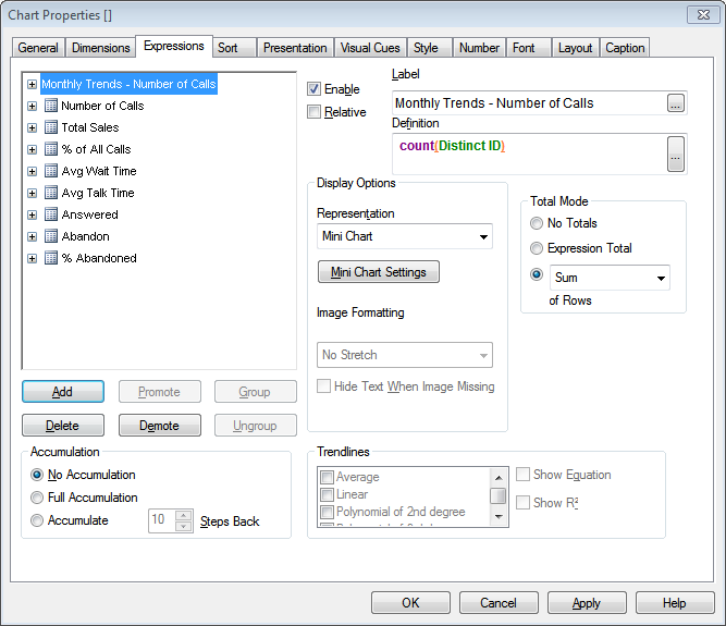
However this has its back side of the moon. Primitive metadata layer means that you wouldn't be able to operate with hundreds of measures and dimensions in one model. At the same time QlikView combines cumbersome and overloaded forms for object properties with surprising inability to easily adjust basic visual settings like background color or font size of a table header row. For me QlikView is the first BI tool where I can spend more time adjusting visual appearance of a report than building a data model for it. I wonder -- is it really necessary to have a separate checkbox (!) for rainbow-colored borders (see the screenshot below) when it's not possible to easily adjust the above-mentioned basic visual settings?


Myth #3: With QlikView you don't need a Data Warehouse
Well, if you don't need data warehouse with QlikView then most probably you don't need it in any case. In another words -- for the majority of cases this is not true. First, QlikView by design deals with star-schema models only. Second, volume of data stored in QlikView is strictly limited by RAM capacity. Even with typical compression rate 1:3 this may very soon become an obstacle. Third, despite QlikView has its own ETL engine its data cleansing possibilities are very basic.  So in case of need for good data quality processing a dedicated ETL/DQ tool will be necessary. Forth, the mentioned above lack of good metadata model limits capabilities for metadata management, lineage and impact analysis.

At the same time, good fit for star-schemes, fast response time and quick prototyping make QlikView very attractive choice for data marts built over a corporate data warehouses. Not to forget QV's wonderful capability to merge Excel spreadsheets and text files with data from RDBMSs in a few mouse clicks which makes enhancing DWH data with Excel data very easy for non-technical users -- an important use case. (UPDATE 23/6/2015 - with my new ETL tool EasyMorph you can do it even easier).

Myth #4: QlikView is an enterprise BI platform
Briefly -- no, it's not. While QlikView is a very advanced dashboarding tool with some nice query & analysis capabilities it wouldn't cover the needs for heavy reporting, ad hoc analysis across hundreds of measures and dimensions, balanced scorecarding, data mining etc. which a large enterprise might have. Lack of single, easy manageable and scalable security model also limits areas of applicability for QlikView. Currently, in order to manage user access rights one should set them up in 4 (!) places -- load script, document properties, visual object properties and QlikView Publisher. While it's more or less bearable for 50-100 users, I guess you wouldn't want to go through all of this for a few thousands of users.

Myth #5: QlikView is inexpensive
As of price-list, QlikTech offers a pricing model which is rather attractive for small businesses when compared to offerings from its larger rivals -- IBM, Oracle or SAP. However, when it comes to larger deployments, the difference in cost per user becomes smaller and sometimes not in favor of QlikTech.

According to Gartner:
"QlikView is increasingly seen as expensive — almost a third of its customers surveyed (31.4% vs. 26.1% in the whole sample) see this as its main barrier to wider use. Its pricing model often does not sit well with larger deployments to more users, nor does the investment in RAM required to support the increasing numbers of concurrent users." (Gartner's MQ for BI platforms 2011)
At this point you might think that QlikView isn't worth its money. Well, while QlikView is definitely not what QlikTech's marketing propaganda is trying to tell us, it's still worth consideration.  Short time-to-production, good capabilities for data manipulations by non-technical users, very interactive point-and-click user interface and high-speed query processing -- all of these can definitely make QlikView a good fit for some people in your organization.

Read also: Really, is QlikView a BI tool?

March 24, 2011

Explainum

In May, 2010 I've started a project which seemed like an adventure -- I decided to build web-service for creating charts with comments linked to data regions. I did it because I think that BI and data visualization industry have missed one important point -- they do not deal with human interpretation of visual data. In another words, existing BI and data viz tools just get data, draw picture and stop there. All findings from that data, as well as thoughts, questions, conclusions and forecasts about it remain outside of a system. While people generally used to it, nevertheless it produces some inconveniences. Here are some of them:
  1. It's not an easy task to find reasons for a KPI change in a certain period -- neither popular data visualization tools nor search engines are note capable to do this simple thing which is obviously needed in the business world.
  2. Knowledge of influencing factors behind KPI trends is spread across emails, documents, IM messages (this makes p.1 even less easy).
  3. As majority of influencing factors are rather qualitative than quantitative, so they remain out of decision-support systems (hmm... why are they called decision-support systems in this case?).
Thus, I've decided to make a tool that will deal with this problem. It's called Explainum. It is not in production yet -- we're just about to launch closed beta-testing. If you want to take part in it -- feel free to register.

Some of its features:
  • Trend charts, which can automatically update data set with new data every day from various data sources -- CSV files, stock market data, currency exchange rates or web-services like Google Analytics
  • Users can create/read comments for selected data regions. In order to find comments related to a certain time period users should simply select a rectangular area on a chart
  • Charts can be embedded into 3rd party web-pages as interactive widgets
Read "What is Explainum?" for more detailed descriptions of the idea behind Explainum or see sample widgets. Here is screenshot of chart made using Explainum -- just to give you an idea how it looks like (clickable). As you can see -- commented areas are highlighted and chart has list of comments attached.


March 4, 2011

Teradata acquires Aster Data: Final switch to a new generation of analytical engines

Following HP's acquisition of Vertica, Teradata decided to buy Aster Data. The deal is a noticeable milestone -- now all major vendors of DWH platforms have switched to a new generation of analytical engines:
  • Teradata will have Aster Data soon
  • IBM has Netezza
  • Oracle has Exadata
  • Microsoft has SQL Server Parallel Database, going to have columnar storage in Denali
  • SAP has Sybase IQ, Sybase MPP, Explorer Accelerated
Not to forget emerging players on DWH market:
  • HP with brilliant Vertica
  • EMC with Greenplum
The new generation  features (in various combinations) Massively Parallel Processing (MPP), columnar storages, hardware SQL acceleration, MapReduce, advanced in-database analytical functions.

Era of row-based SMP databases for analytical workloads on large datasets has gone. Don't miss the train.

February 23, 2011

3 reasons why you should use wiki for BI deployment

As I mentioned in one of my previous posts, BI vendors do not pay much attention to collaboration around BI deployments. However, this doesn't mean that large BI deployments don't have difficulties (or at least inconveniences) with collaboration and knowledge exchange. Some of these problems can be resolved using wikis:

First, and the most often problem -- lack of documentation convenient for both business users and technical team. Traditionally, project documentation (like specifications, glossaries, scopes of works, etc.) is done using Word/Excel documents. This results in network folders filled with tens or even hundreds of documents without any browsing possible. No need to say, that average business user will never look there. As BI-platforms doesn't have any good collaboration capabilities (excluding may be IBM), so user doesn't have many choices if he/she needs to know the logic behind certain indicator in a report -- only to ask somebody from tech team. In case of 5 users and 10 reports -- this is not a problem. But if you have 2'000 users and 10'000 reports -- this would be a problem. Often users, having such obstacles, just don't want to dig into details. And then we have low user adoption. So, reason #1 -- you need wiki to have the documentation searchable, manageable, consistent and convenient for use by business users first of all.

Reason #2 is that users usually don't have good How-To manuals. BI vendors usually do rather good manuals for developers, but in majority of cases they do not produce good illustrated manuals for business users. How to drill data, how to join data from two data sources, how to make ad hoc queries with subqueries, etc. etc. -- for all of these how-tos users need simple easy-to-understand illustrated manuals. And, what is important -- these manuals have to be easily extensible to target specific problems, if they occur.

And, finally, reason #3 is that large BI deployments typically have several BI tools. All of them have more or less decent portals for their own content, but none of them can hold BI content from other BI platform. Cognos knows nothing about BusinessObjects reports or QlikView application, Oracle BIEE knows nothing about Tableau and so on. At the same time a user might need access to several BI suites to perform his/her daily tasks. This is why you may want to have single subject-oriented (not tool-oriented) portal that would have links to various BI-content, or even have BI content embedded just in wiki pages. The latter may require some web-development works, as not all BI tools allow easy content embedding, and setting up integrated security, but it can also lead to much better convenience and user adoption.

There are a lot of wiki engines available -- free and commercial, easy and complex, etc. Wikimatrix can make the task of choice a bit simpler. I found DokuWiki to be perfect tool for majority of cases.

February 21, 2011

CV as dashboard

A few weeks ago I read on HackerNews a story about one designer, who made his/her CV as infographic artwork. This idea inspired me to create my own resume in a form of QlikView dashboard. So, I spent 3 hours to create QlikView application, that visualize my experience, education and some skills. As it appeared rather good to me, I decided to test the idea by publishing it on LinkedIn in QlikView group (link).
The response has surpassed my expectations. I've got a lot of very good and encouraging comments from people all around the globe. I've also got some mails from recruiters and potential employers, but this time without any result (not having US/EU work permit is a huge obstacle). Two weeks in a row LinkedIn had been indicating me as top influencing person in the group. The CV was also published as Creative CV #19 on www.globalrecruitingroundtable.com.

While it was almost a joke, I think the idea has some reason behind it. A random resume looks like typical poorly designed BI report -- too much text, small font, and sometimes, too much formatting. At the same time, every recruiter needs only some key facts and figures from a resume in order to make a decision -- whether to continue with it or throw it into waste basket. Clean and accurate visualization of these key facts and figures could make their life easier.

(click to enlarge)

February 17, 2011

A few slightly pessimistic comments on Gartner's BI Platforms report 2010

Gartner's annual BI reports always create a lot of buzz, when issued. The most discussed (and perhaps, the most contradictory) part of these reports surely is the "quadrants" with vendors positioned inside.

Ironically, these quadrants definitely are not the most interesting and valuable part of the report. Really, I don't know what valuable knowledge can be obtained from them. The latest-greatest BI? Come on. In BI rollouts every organization has it's own set of goals, criteria, preferences and restrictions that need proper analysis and specific solution. How would you apply that quadrants there? In my opinion, the quadrants are just too abstract to be practically useful.

Gartner fulfills tremendous task of identifying market trends, surveying numerous users and analyzing complex product portfolios, and they do it very professionally. I find the sections Market Overview and Vendors Strength and Cautions very compelling and worth in-depth reading. Can't say I agree with everything there, but no doubt, it's a good job done by smart people.

A few comments on Gartner's Market Overview this year:
  • "Data discovery platform momentum accentuates the need for a portfolio approach". Last year Gartner mentioned that idea of "BI-standardization" has actually failed -- more and more customers intentionally use 2-3 BI-platforms to cover needs of business users better. This year the trend continues. As of today, there is no single BI-platform that can effectively cover needs of a large enterprise, solely.
  • "Data discovery" is a new hot thing this year -- did you notice this? Do you remember the hype about "pervasive BI" a few years ago? Did it make any revolution? Well, no. Will data discovery do it? Who knows. However, it's obvious that BI industry still can't overcome it's biggest problem -- low adoption rates among non-technical users. What concerns me is that this year there is absolutely nobody in the Visionary quadrant -- it means that there will be no any significant innovations in the next 3-5 years. No really fresh ideas on BI market. Well OK, QlikView has shown very interesting and innovative approach to BI. But their recent new versions (10, 9, etc.) look more like boring updates rather than new breakthrough.
  • "Shift from measurement to analysis, forecasting and optimization". This is what BI is for -- to drive businesses in the right direction. However, I don't believe in hype about predictive analytics. This is just another wrong attempt to overcome the above-mentioned biggest problem of BI. Building predictive models is not a simple task and it requires from user to have skills in statistics at least to understand what's under the hood. Tools will not magically compensate lack of these skills. No magic.
  • "Mobile BI" -- another one hot thing in BI. Will BI revolution come from this side? Who knows. What's good about it -- is that this trend is inline with global, fundamental shift in lifestyle which is happening now. What's not good about it is that common hype about tablets (iPads, etc.) inflates hype about mobile BI. Hype about tablets will fade as more and more people make distinction between toys and tools. But today this hype prevents us from clear understanding the value mobile BI can give. Really, is it a toy or a tool?
  • Unfortunately, the second current fundamental shift in lifestyle -- socialization -- didn't get proper reflection in BI industry. And this is disappointing, because this is clearly the way to better productivity caused by better knowledge exchange. And knowledge is what business intelligence used to be proud of. I believe, social BI, if designed properly, can have much higher chances to bring valuable innovation to what is called "management information systems". Who's going to do this?
Links:
[1] - Gartner's Magic Quadrant for Business Intelligence Platforms (27-Jan-2011)
[2] - Paul Graham's essay about tablets

February 16, 2011

Where to get free analytical database management system

It's not a secret that majority of popular relational DBMSes (e.g. Oracle, MS SQL Server or MySQL) were originally designed for transactional processing. Besides other features, they employ row-based data storage and SMP-architecture which is good for OLTP systems, but in case of analytical applications (like enterprise data warehouses) that require heavy scans and data aggregation, this is far not the best case. Usually, analytical workloads are handled much better by purpose-built analytical DBMSes. If you want to try such DBMS without hassle of dealing with sales people there're at least 4 options to try an analytical database yourself and for free:

Greenplum Community Edition
http://community.greenplum.com/

This is analytical relational DBMS designed for heavy workloads on terabytes of data. Its core is derived from PosgreSQL, which assumes that data is still stored in rows, however Greenplum has MPP architecture.
The free community edition is limited to 2 CPU sockets or 8 virtual cores.

Infobright Community Edition

http://www.infobright.org/

Infobright is truly columnar DBMS, however not so popular as Sybase IQ or Vertica. The free Community Edition is simplified version of commercial Enterprise edition and is open-sourced. It lacks some features that can be important for large-scale deployment: DML, Temporary Tables, Parallel Query Execution and some other. Nevertheless, even this limited edition can show 5x-10x performance improvement on small datasets (say, up to 0.5TB).

LucidDB
http://www.luciddb.org/

LucidDB is also columnar DBMS which is open-source from origin. I've not heard about any large-scale deployments of LucidDB, however some benchmarks show impressive improvement over MySQL. So, if you use the latter for analytical workloads give a closer look at LucidDB.

MonetDB
http://monetdb.cwi.nl/

Another one open-source columnar DBMS which was designed in the Netherlands. Features include enhanced support for XML and multimedia objects, and support for modern CPU architecture.

Intro to this blog

In 2010 I launched russian-language blog BI Review (http://www.bi-review.ru) which is dedicated to Business Intelligence and Data Visualization, and where I used to share my thoughts about BI tools and market trends with russian-language audience. The blog has got some attention from readers and number of visits crossed the 1000 visits/month mark in a few month. I also noticed that some english-language readers of the blog tried to read it using Google translate services but I'm not sure whether this helped them a lot.

Therefore, to make things a bit simpler for them, I decided to start my english-language blog (the one you're reading now) dedicated to the same theme -- Data Visualization and Business Intelligence tools, Data Warehouses and Corporate Performance Management systems. This blog is not exact copy of the russian-language blog. First, it would be very time consuming to translate every article, and second, there are some thoughts I would like to share with the english-language audience solely.

Gradually, this blog became my main blog related to my professional activity. It is visited by more 3000 readers every month. Since I moved to Canada in 2012 I keep blogging only in English.

About me: I'm BI enthusiast since 2004. My professional bio is available at LinkedIn at www.linkedin.com/in/dgudkov. Feel free to connect with me there or follow me (@dgudkov) on Twitter.

Enjoy and have fun!

Dmitry Gudkov